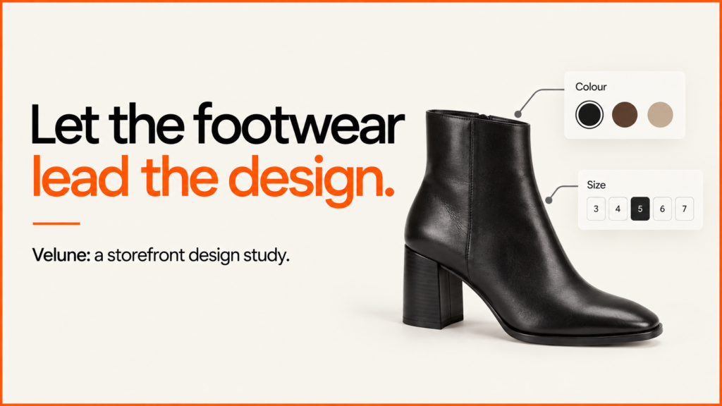
I was contracted to update the storefront’s design, address performance issues and carry out an SEO update. The brief covered how the site looks, how fast it runs and how well it shows up in search.
Discuss your projectSee selected work
The 2026 Velune redesign brings fashion photos, product browsing and editorial content into one shop that feels the same throughout. I built the look and the storefront around one simple rule. The shoes make the first impression, and the interface makes the next choice easier. The final theme and website relaunch are planned for early 2027.
The work spans the homepage, collection browsing, product pages, brand story and journal. Warm neutrals, generous imagery and restrained typography connect those pages, giving heels and heeled boots a considered setting from the first campaign photograph to the product details.
A visual identity built around the collection
A footwear purchase starts with appearance, but it rarely ends there. Shoppers need to understand the silhouette, see the finish and imagine how a pair will work with clothes they already own. The design gives those different ways of looking their own space.
Campaign photographs introduce movement, styling and occasion. Product images bring attention back to the shoe itself: the curve of the heel, the shape of the toe and the relationship between straps and upper. Neither type of image has to carry the entire shopping journey.
The palette uses warm cream surfaces and dark brown text, with soft yellow and pale blue appearing in the imagery and supporting sections. The type stays quiet, so image size and layout do the work of showing what matters most.
The photographic direction leaves room for texture. Creases, uneven fabric, natural shadows and slightly informal compositions make the setting less sterile. A high-fashion presentation benefits from attention to detail, but every surface does not need to look untouched.
The homepage: a stronger first impression
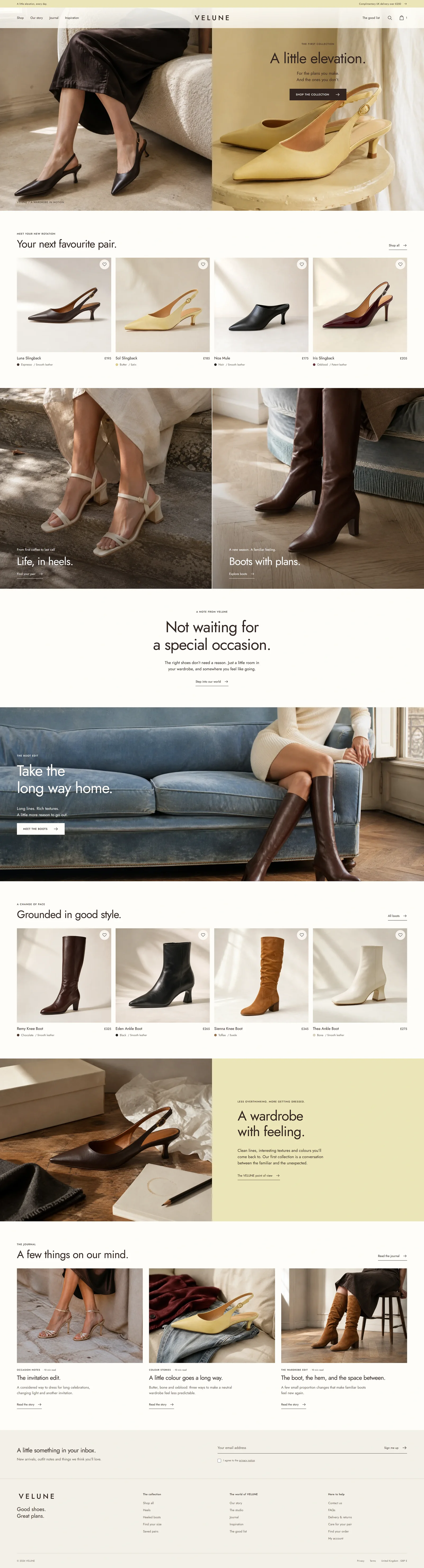
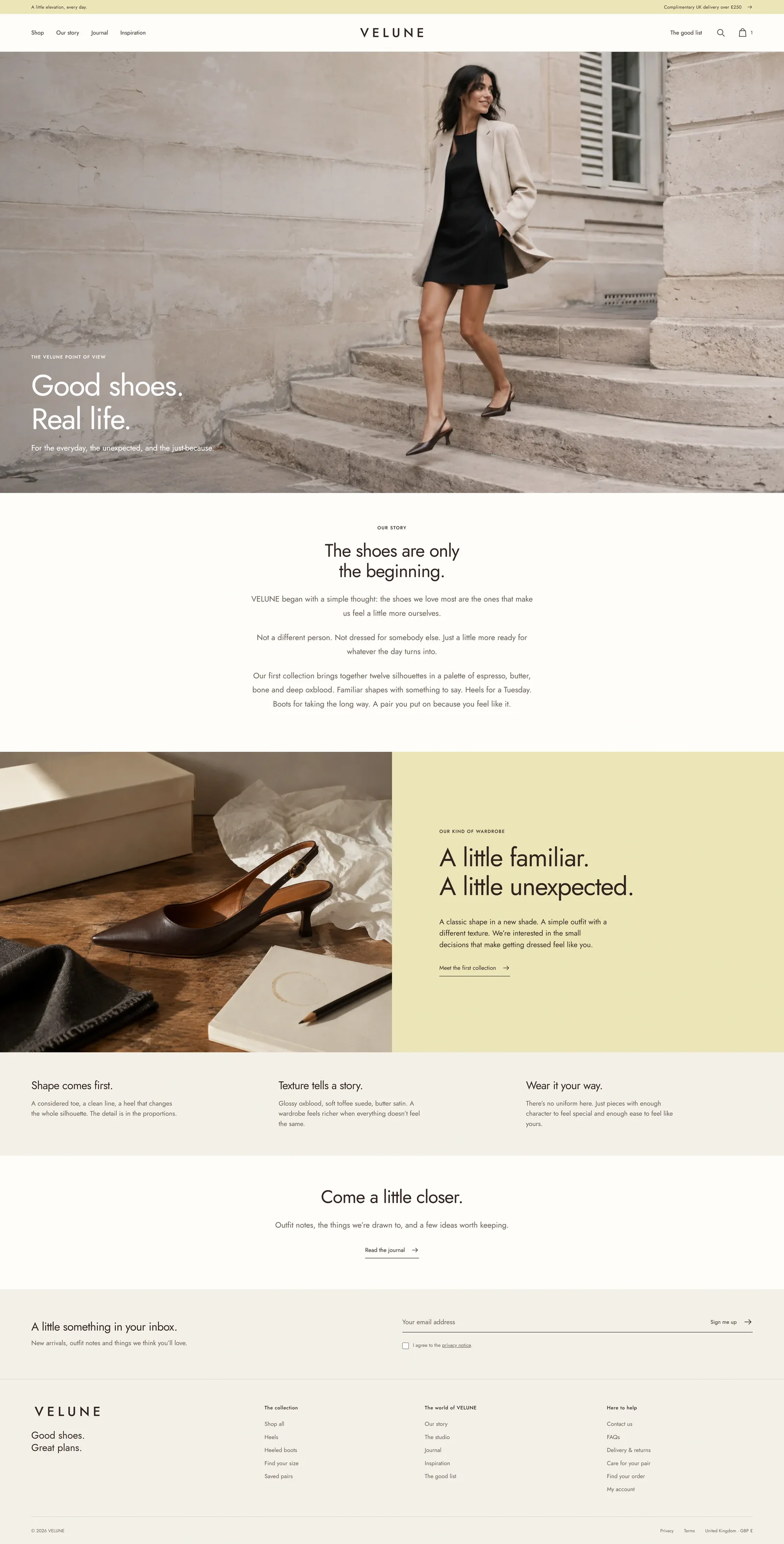
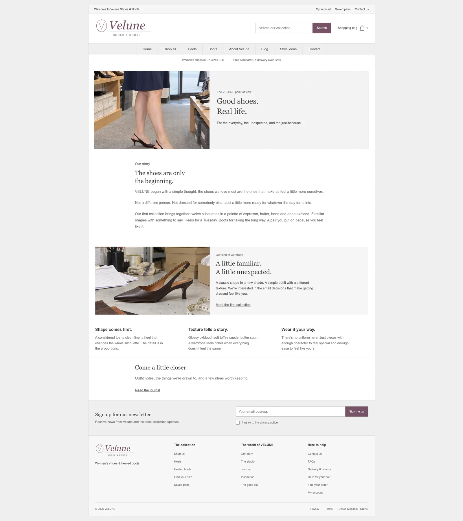
The homepage opens with two editorial images that set the tone of the collection straight away. The centred logo, small menu and short headline leave most of the space to the photos. A clear shop button links that first impression to the range.
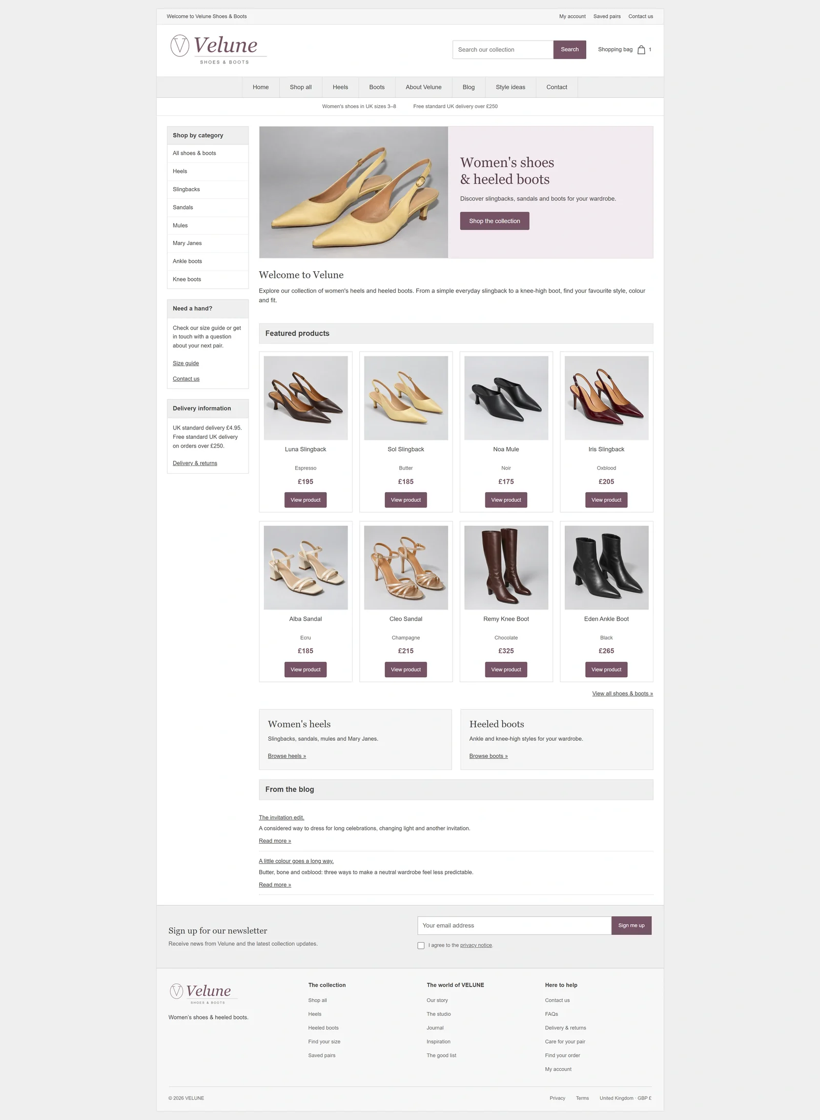
In the older layout, a boxed frame, a smaller campaign area and separate menu blocks pull attention away from the products. The redesign gives the collection more space and fewer competing edges.
Below the opening, the page moves through selected products, silhouettes and campaign moments. Each section provides a different route into the range. Someone who knows the type of shoe they want can browse by shape; someone arriving for inspiration can follow the styling.
This sequence matters as much as the opening image. The design alternates broad photographic sections with more focused product selections, sustaining interest beyond the first screen while keeping shopping within reach.
 Before · reconstructionAfter · 2026 redesign
Collection browsing: putting the shoes first
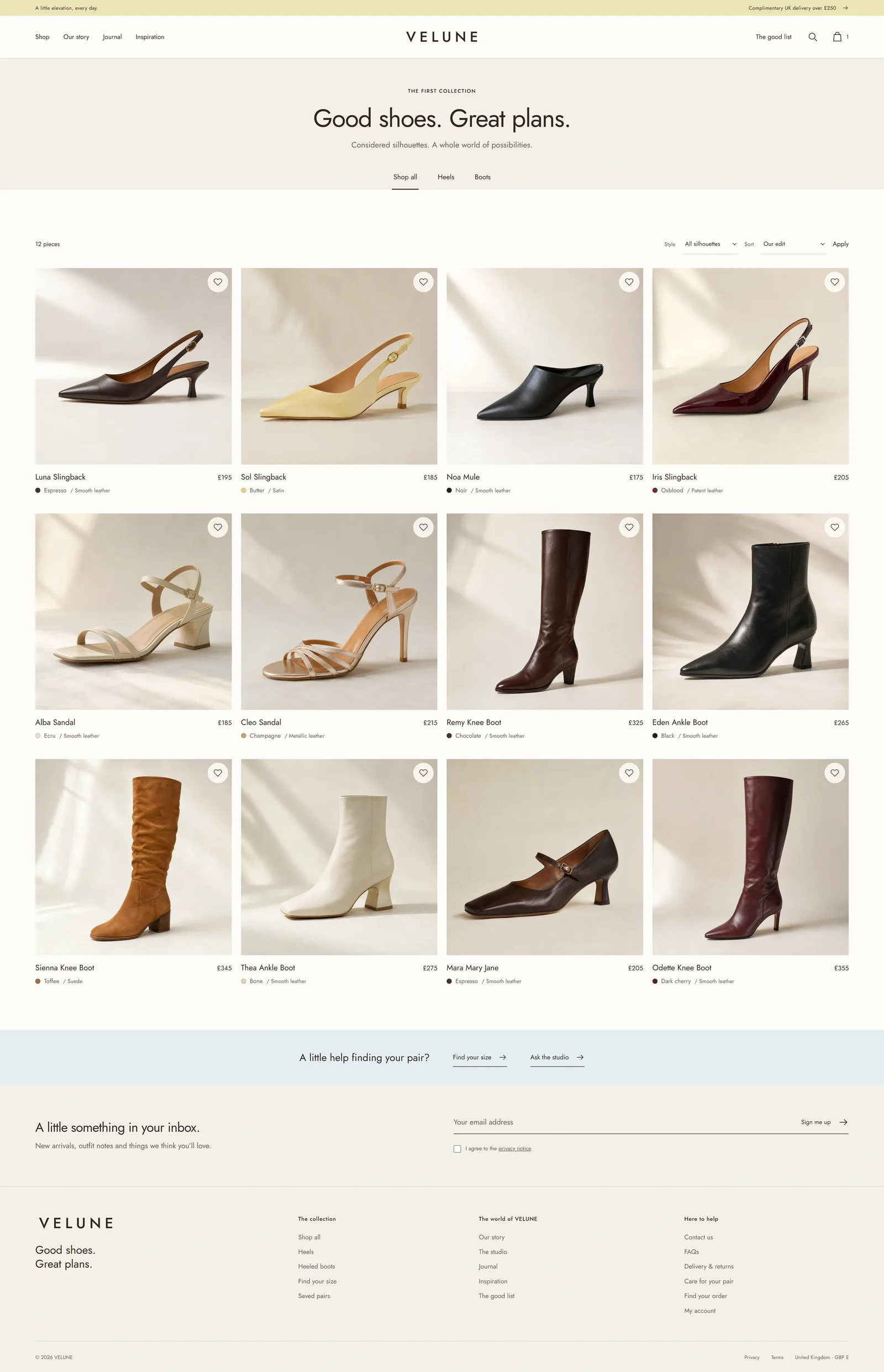
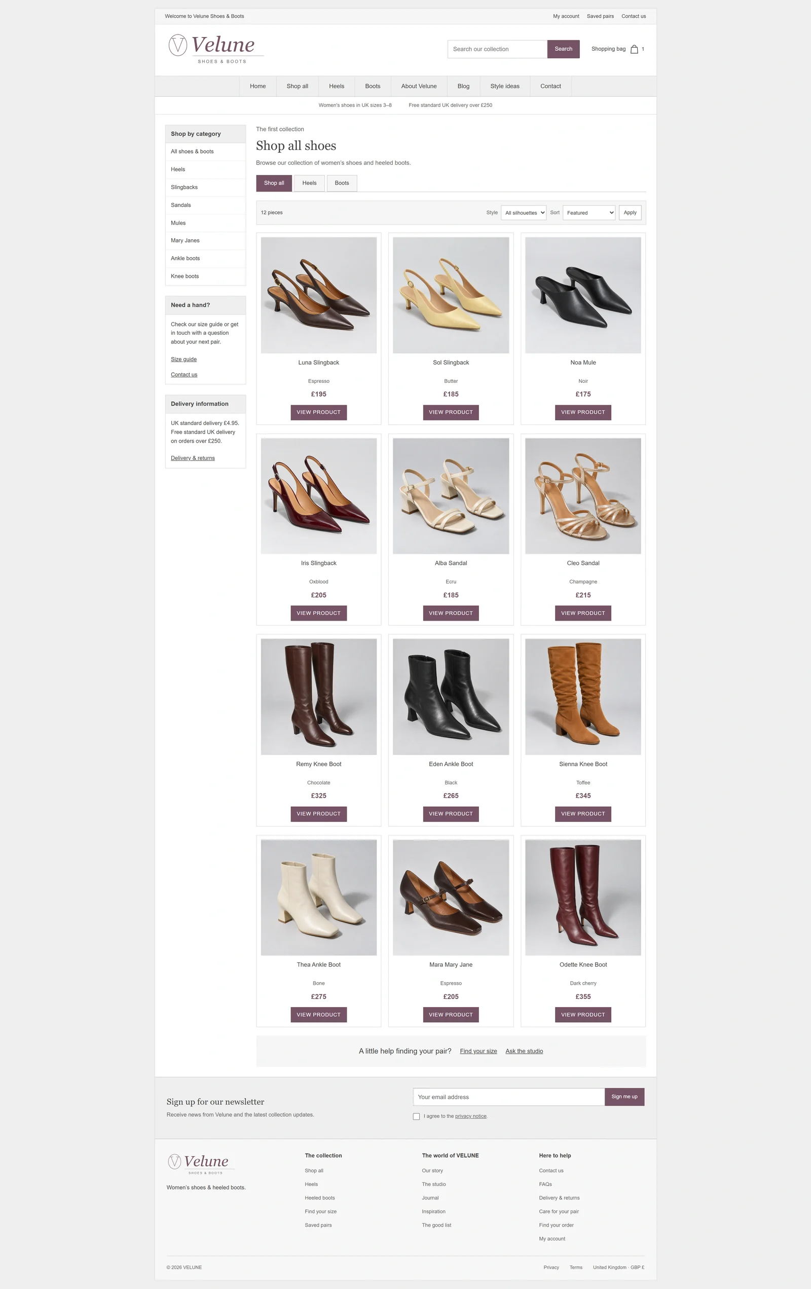
The collection layout uses larger product photographs on a warm, consistent background. Product names and prices sit close to the images, making each card easy to read as a single unit. Filters and sorting support browsing without becoming the most prominent elements in the composition.
Removing heavy card borders and reducing the visual weight of the sidebar changes how the range reads. Differences between a slingback, a sandal and a heeled boot become easier to notice because there is less decoration surrounding each one.
Similar crops and details in the same place let shoppers scan the grid without learning a new layout for each product. The products bring the variety. The interface stays the same.
Collection pages keep the warmth of the homepage but make it easier to compare. It feels like the same shop, not a jump from a fashion campaign to a separate catalogue.
 Before · reconstructionAfter · 2026 redesign
Product pages: desire and detail together
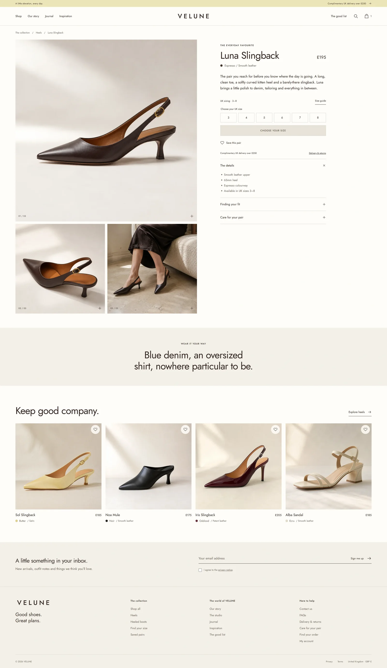
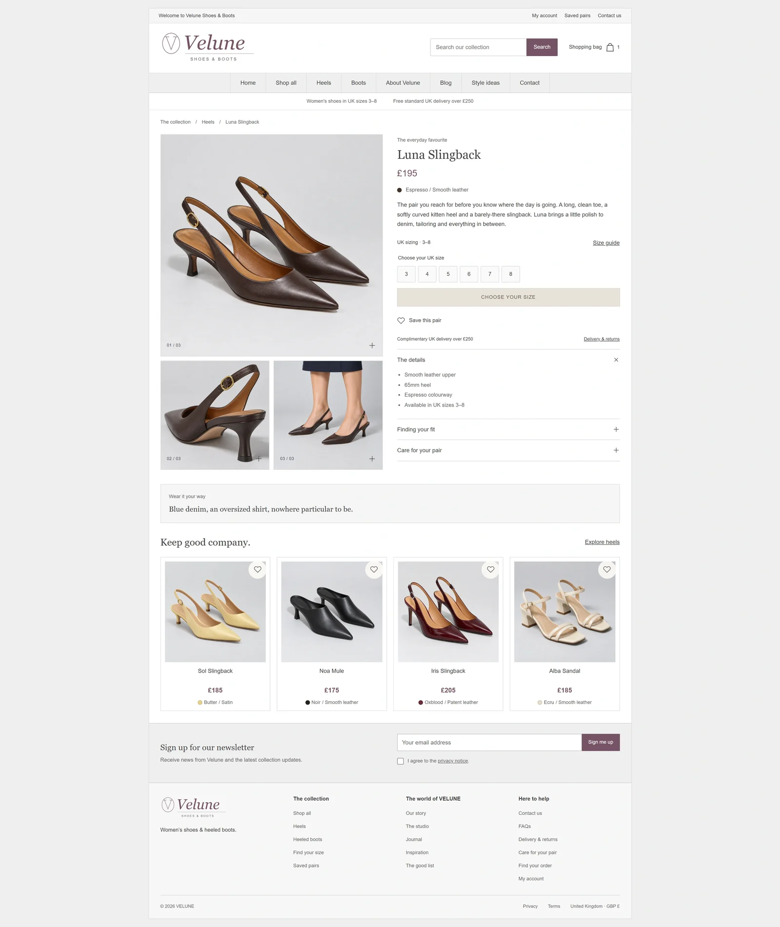
The product page puts a large image gallery next to the details needed to choose a pair. The name, price, size choice and add-to-basket button sit together as one clear group. Other details use the same style, with enough space that the buying controls still stand out.
For the Luna Slingback, the photography shows the complete silhouette and closer details. A shopper can move from the overall shape to the finish and construction while keeping the product identity in view. Styling imagery adds context alongside the direct views of the shoe.
Some visitors arrive ready to select a size. Others want to examine every image, read about fit or check delivery information before deciding. Grouping the main controls clearly leaves room for both behaviours.
The gallery needs enough scale to reward inspection, while the buying panel needs enough space for the options to remain legible. The design balances those two areas without filling every available gap with another message.
 Before · reconstructionAfter · 2026 redesign
The brand story: extending the same identity
The brand page carries the storefront’s visual language beyond the shopping grid. Large photographs, shorter passages of copy and a clear sequence of sections make it feel related to the rest of the site.
The photography continues to communicate material, mood and occasion, while the writing gives those images a more specific context. Changes in image size and text placement guide the reading order and give each idea enough room to be understood.
Connections back to the collection keep the story part of the buying journey. Someone arriving through the brand page can move naturally towards a relevant product or category, carrying the same visual impression with them.
 Before · reconstructionAfter · 2026 redesign
The journal: another route into the range
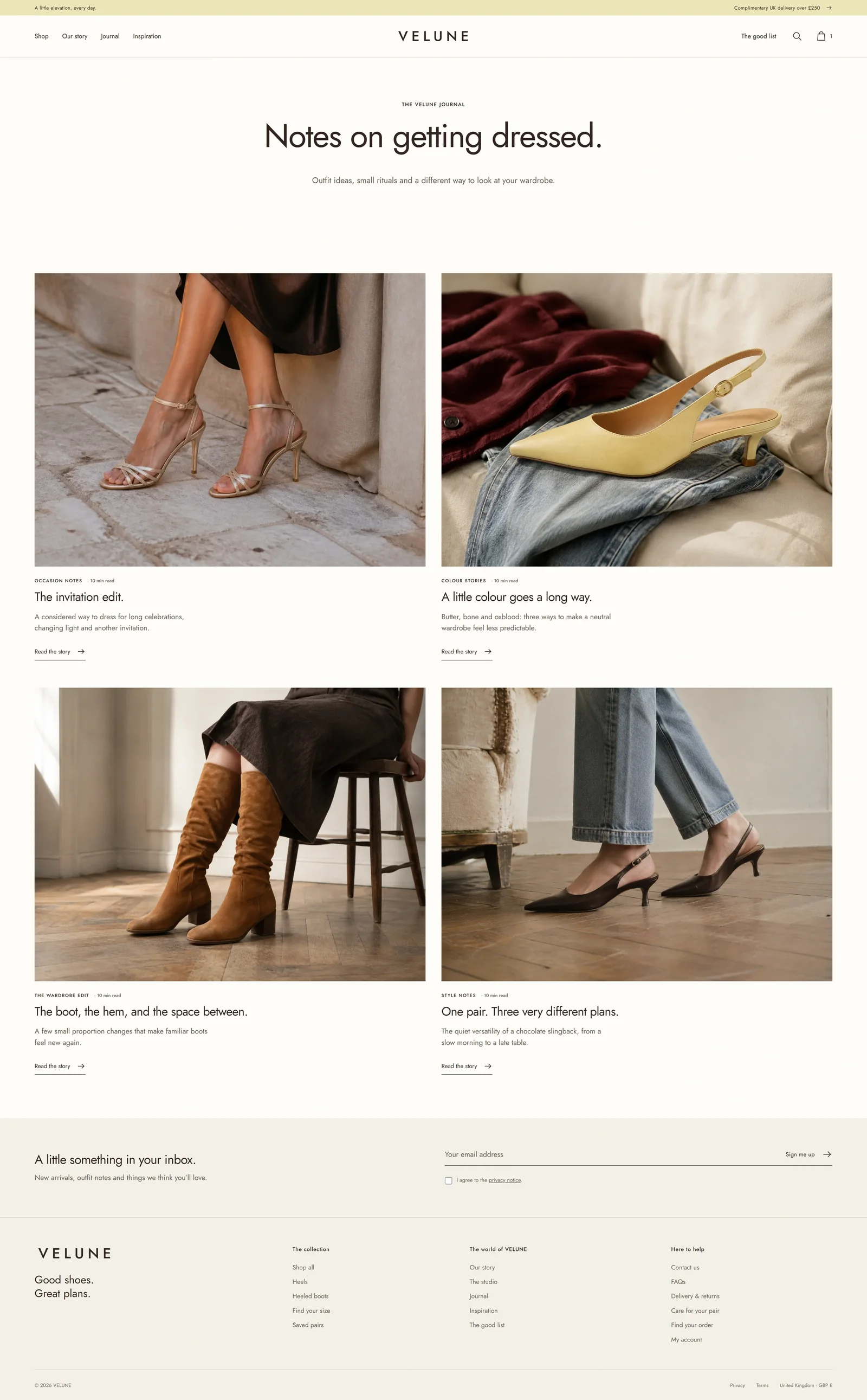
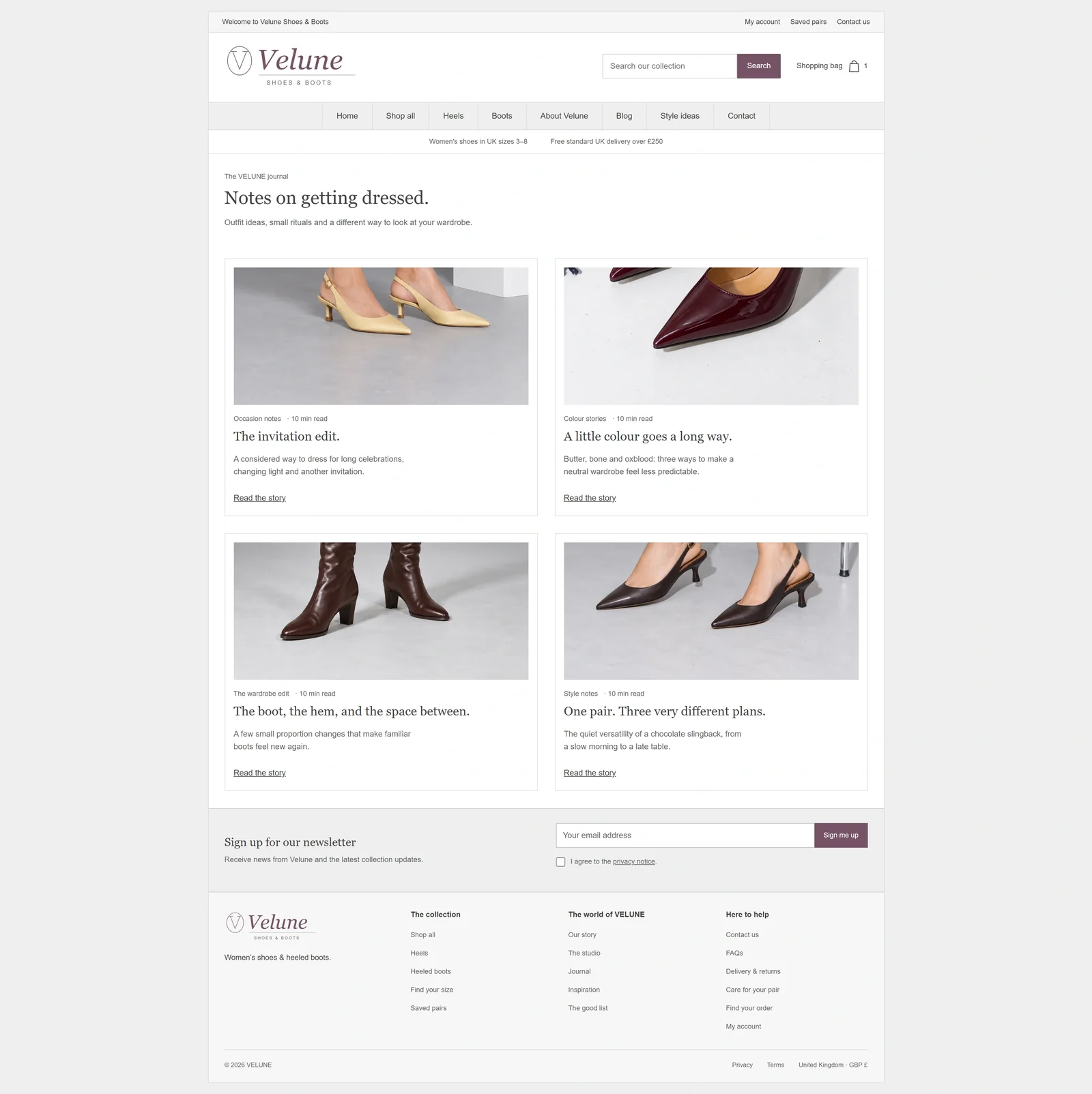
The journal gives styling, occasions and product combinations a place of their own. Its index uses prominent images and a clear title hierarchy, so readers can understand the subject of a story before opening it.
Editorial cards feel related to the product cards without copying them exactly. Both use the same image style and short text. But journal stories need room for a headline that says something useful.
A visitor may arrive looking for an outfit idea rather than a particular shoe. Editorial content can answer that question and introduce relevant products through the styling itself.
The journal also gives the photography a longer life. A campaign image can establish the mood on the homepage, then support a more detailed styling story elsewhere. The connection works when the content adds something beyond the initial visual impression.
 Before · reconstructionAfter · 2026 redesign
Article layouts: room for useful styling content
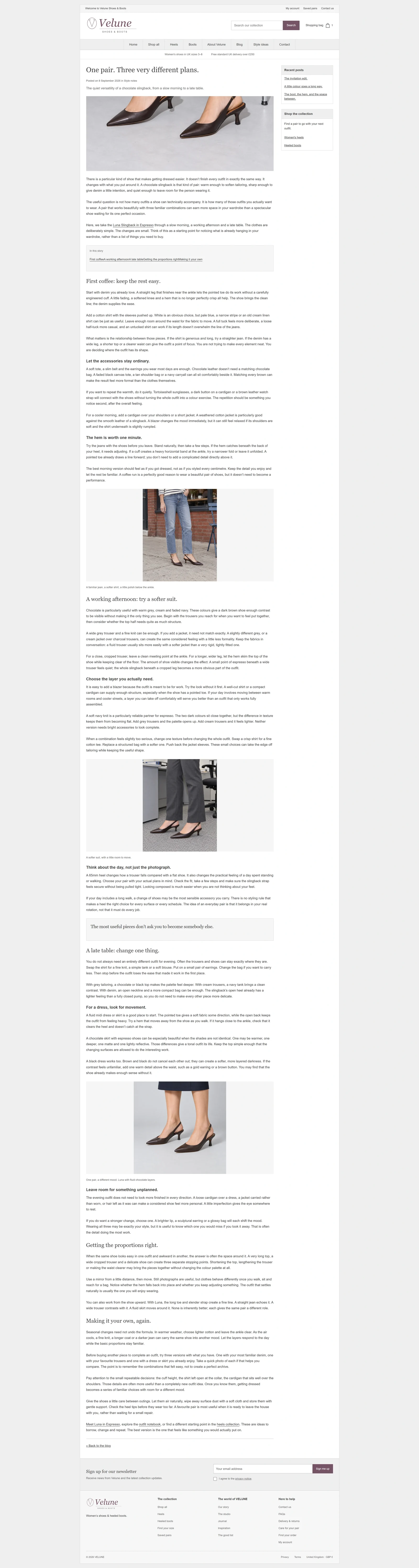
Inside a journal story, the layout shifts towards reading. A clear introduction leads into individual styling ideas, with photographs placed alongside the sections they support. Headings and changes in image scale give the reader a sense of progress.
For a story built around one pair worn in different ways, the sequence is especially important. Each look needs its own space, and the differences should be apparent without requiring the reader to search through a dense column of text.
Product references provide a relevant next step, while the styling advice remains useful on its own. It can help someone understand how a purchase might fit into their wardrobe before they commit to it.
More imagery is valuable when it introduces a new angle or supports a specific point. Repeating similar photographs simply adds length. The design uses a considered sequence of text, images and onward links to keep the story moving.

 Before · reconstructionAfter · 2026 redesign
From the 2026 redesign to the 2027 relaunch
The 2026 design gives the whole storefront one consistent style. The homepage introduces the collection, browsing makes the range easy to explore, product pages bring the decision into focus, and editorial content supplies styling context.
The final theme and website relaunch are planned for early 2027. That release will bring the design together with the launch catalogue and operational setup, including the complete checkout and customer communication journey.
The central design decision remains the same throughout: give the products enough space to create interest, then make the information and actions around them clear. A coherent storefront depends on how well those two responsibilities work together across every page.
Planning an ecommerce redesign? Explore my ecommerce website design and development work, from visual direction and product browsing to the details of the shopping journey.
See more projects on my work page.