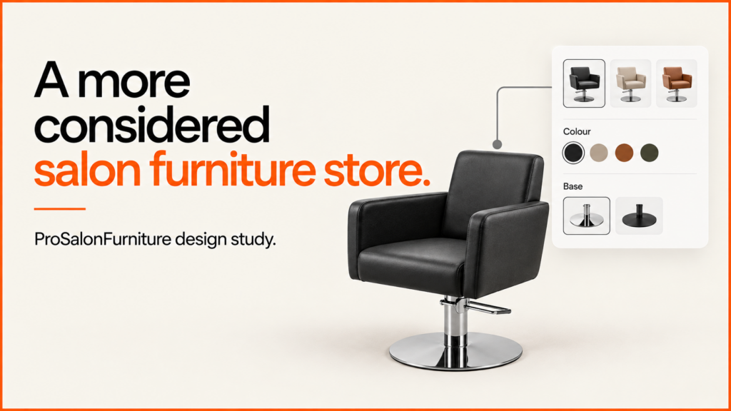
A salon chair is a working tool, but it is also part of the room a client remembers. I wanted ProSalonFurniture to reflect both sides of that purchase: practical information for the person buying the furniture, and a clear sense of the space they are trying to create.
Discuss your projectSee selected work
ProSalonFurniture is a UK salon furniture company preparing to launch its new website. The project covers the brand, product images, copy and a custom WordPress and WooCommerce shop. The whole range shares one consistent shopping experience.
The brief: a complete furniture brand, not just a homepage
The starting brief gave me control over the company name, identity, content and creative direction. The market was the UK, prices were in pounds, and WooCommerce would handle the catalogue and shopping journey. The range comprised 20 salon furniture products, each with three images.
That scope matters. A strong opening screen is only useful if the rest of the site can carry the same standard. I needed a coherent way to present styling chairs, wash units, reception furniture and the supporting pieces, then carry it through collection pages, product information and checkout.
The custom WordPress theme is built around WooCommerce, with a consistent visual system for the catalogue, product pages and checkout.
A homepage that introduces the space
The Classic homepage uses a compact catalogue layout: a small logo, blue-grey navigation, a category sidebar and compact product blocks. It is usable and recognisable as a furniture catalogue, but it gives the brand little room to establish a point of view.
The ProSalonFurniture homepage makes a different first impression. Larger imagery places the furniture in a salon setting. A clearer headline and more generous spacing separate the introduction from the shopping choices. The page has a sequence: understand the brand, explore the range, then move towards a product or a conversation.
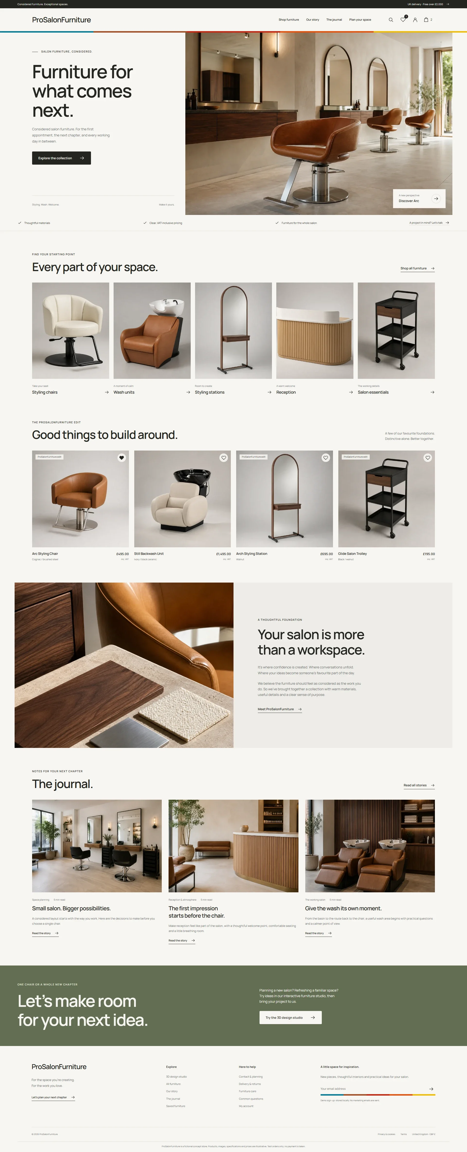
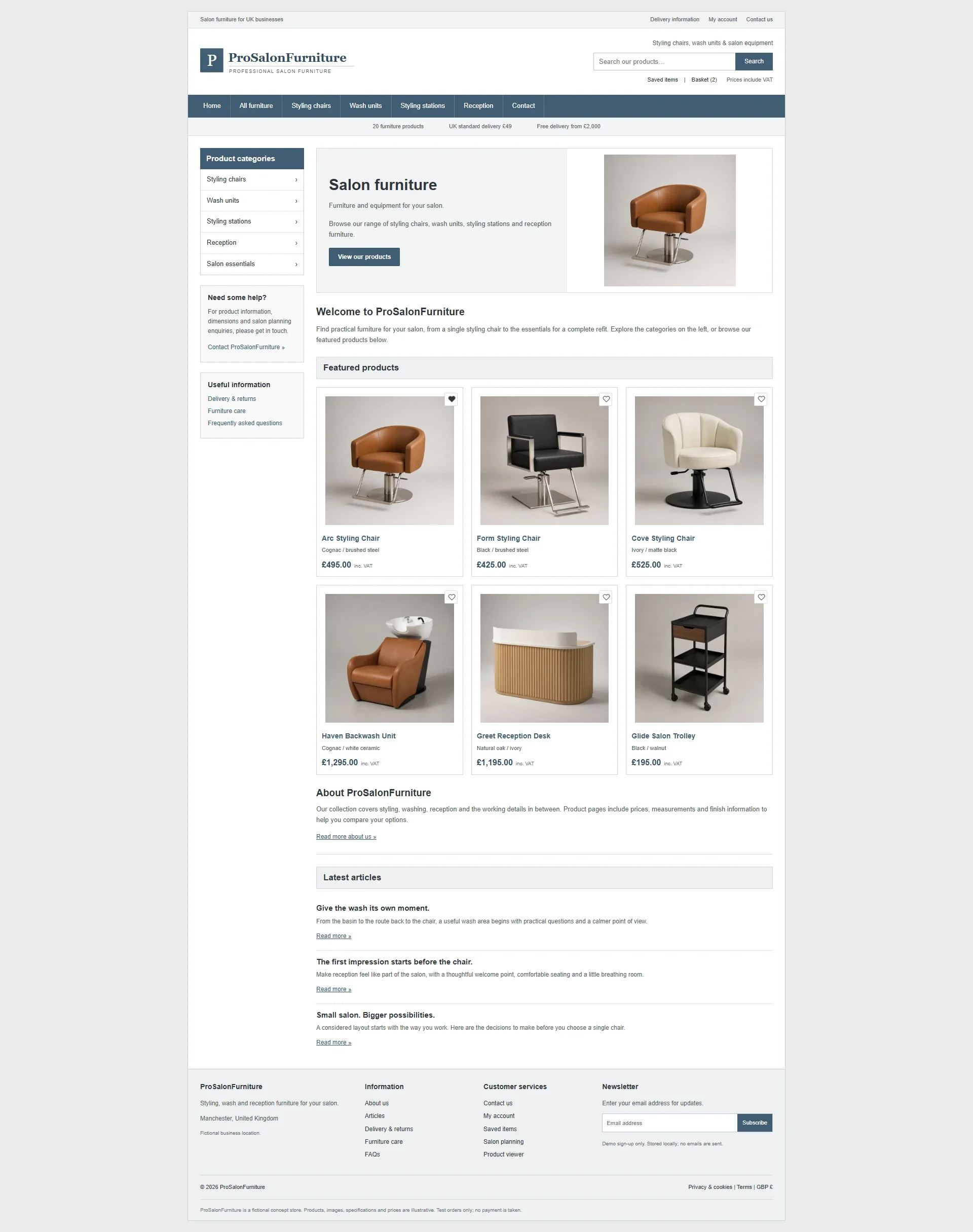 Classic layoutLaunch design
The new logo, calm type and warm neutral colours support that direction. The aim was to make the furniture feel well made without making the shop feel fussy or hard to use. Larger product images and a quieter interface let the materials and shapes do more of the work.
Colour as a recurring detail
The first version needed more colour. A reference image of an Atari-era ribbon supplied the direction: teal, rust, red, orange, cream and yellow. I used those colours as a thin border beneath the header, then repeated the same ribbon at the newsletter section near the bottom of the page.
Keeping that treatment narrow was a deliberate choice. It gives the site a recognisable detail at two distant points in the journey without turning every button, heading and background into a competing accent. It also connects the top and bottom of a long page, so the newsletter feels like part of the same brand.
A catalogue with room to compare
A furniture catalogue needs enough information to make a short list. The buyer should be able to tell products apart quickly, see the price and pick the right category without opening every item.
In Classic, borders and tightly packed cards give each product a small, separate box. In the polished version, larger product images and a more consistent rhythm make the range easier to scan. The surrounding layout recedes, leaving the furniture and its names more prominent.
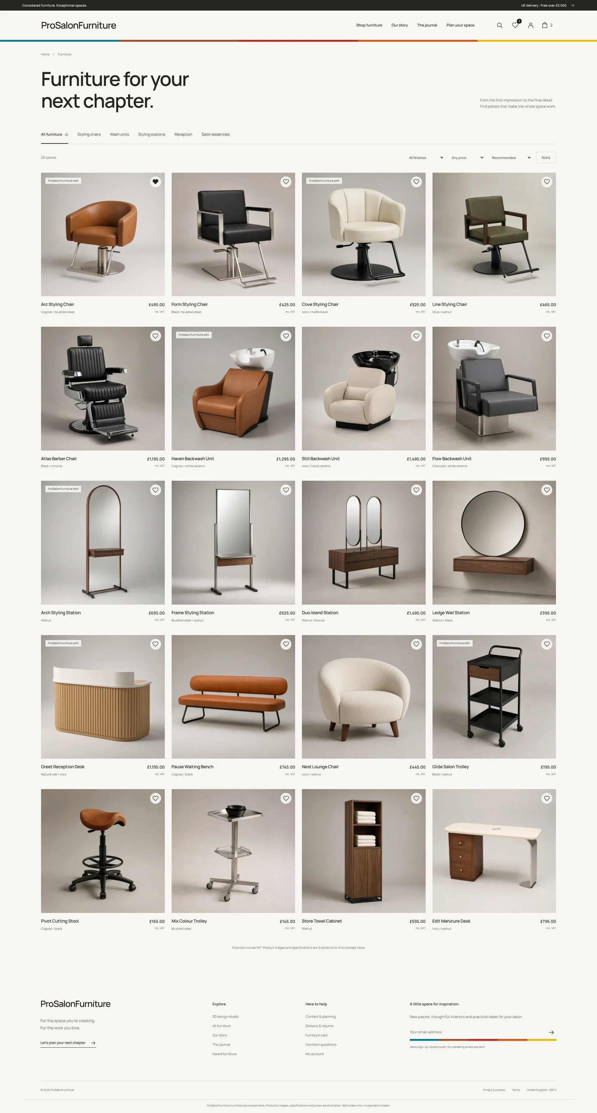
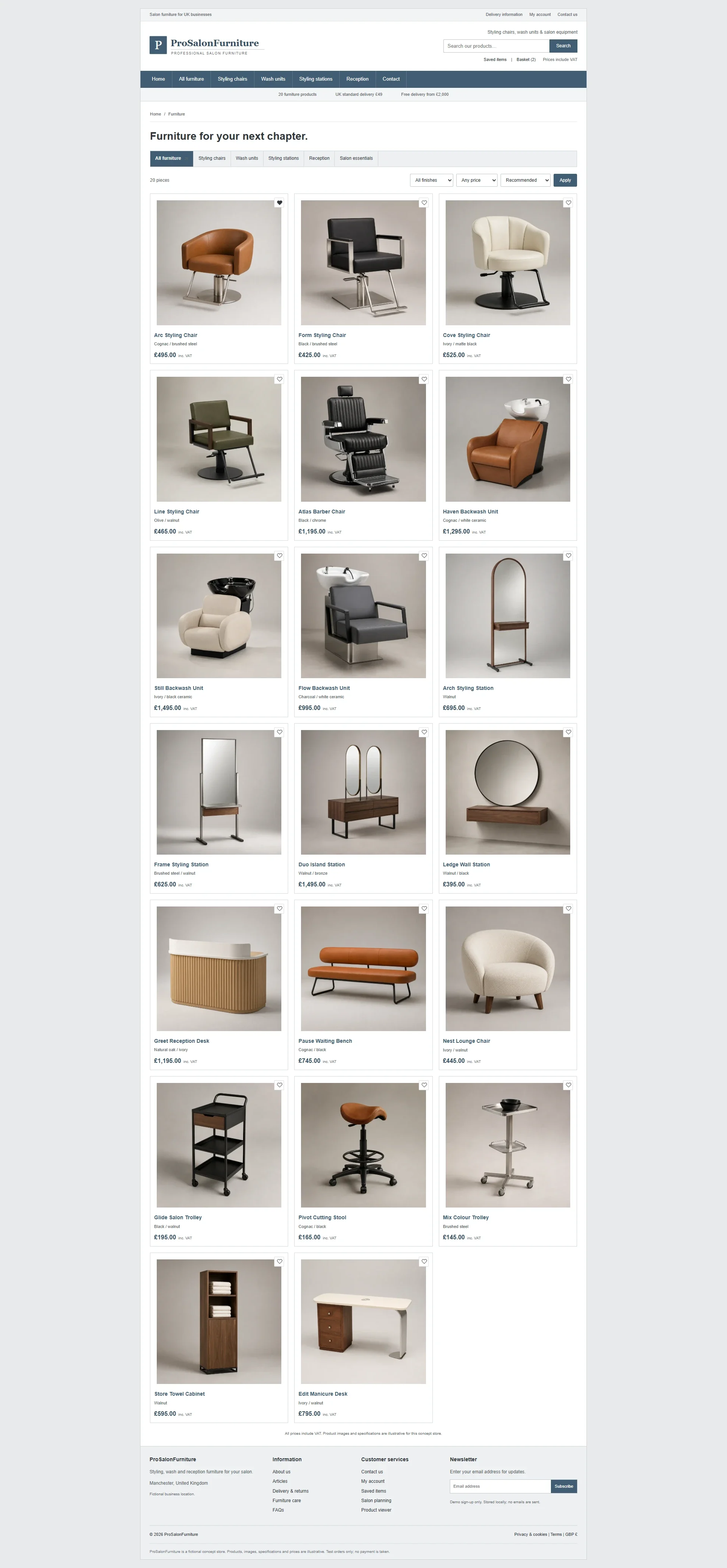 Classic layoutLaunch design
Both layouts use the same catalogue. Larger images, clearer spacing and consistent typography give each product more presence and help buyers compare the range.
Product pages that support a decision
The product page has to connect the visual impression with the practical decision. For a salon owner, the shape and finish may attract attention, but the dimensions, description and price still need to be easy to find.
The Arc styling chair comparison shows the difference at that point in the journey. The finished page gives the gallery more space and keeps the buying details in a clear column beside it. More detail sits below, so the first view stays focused and the full description is still there.
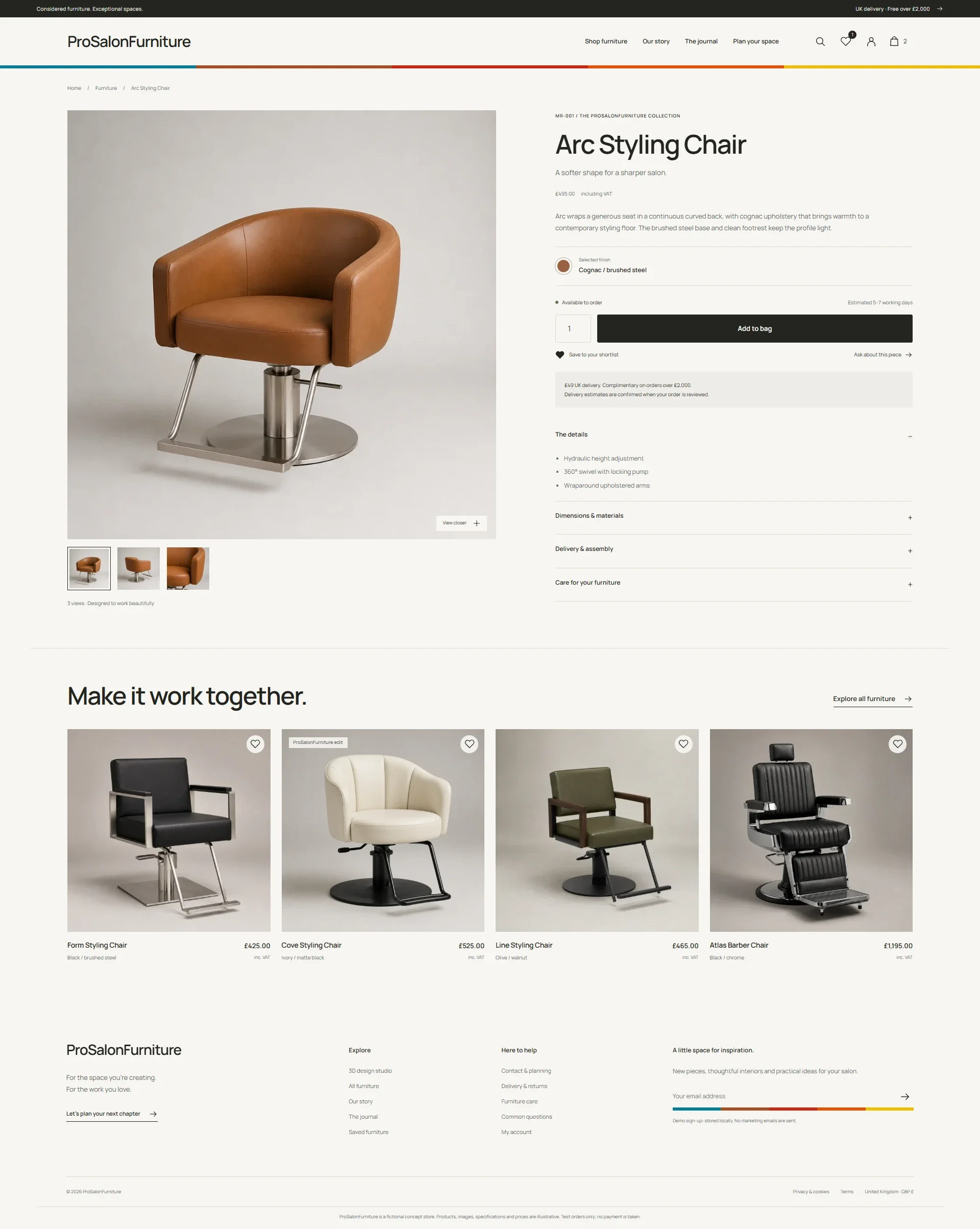
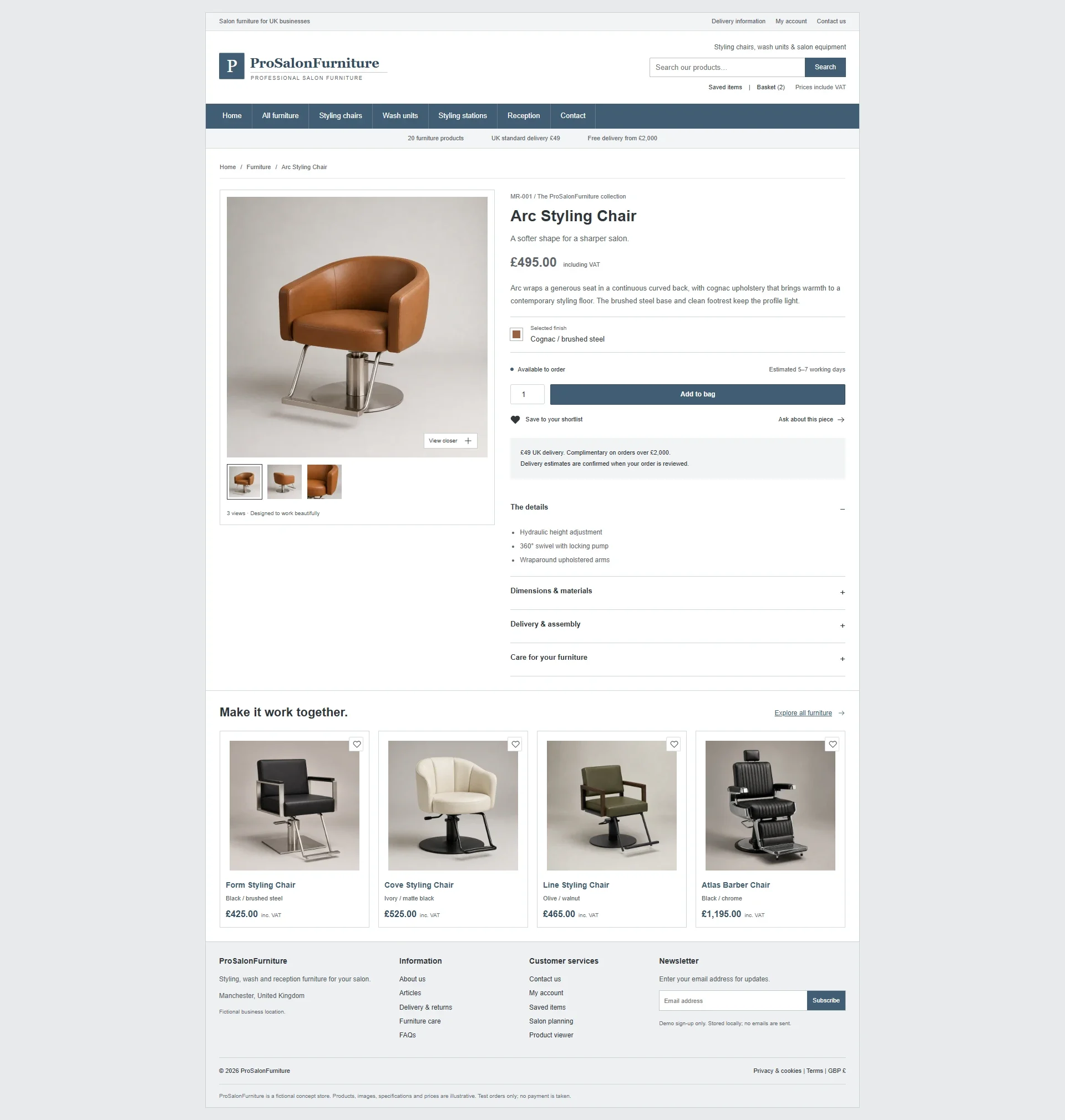 Classic layoutLaunch design
Three images per product give buyers a fuller view of the furniture. Their value depends on the page around them: useful scale, clear gallery controls and a stable relationship between the product name, price and action. I wanted the product page to feel like a continuation of the homepage, with the same care applied to the buying controls.
Giving the supporting pages a job
An ecommerce brand is also expressed in its quieter pages. The story page explains the position behind the collection; the contact page gives someone a route forward when a product listing does not answer their question.
The difference in the story page is especially useful to compare. Classic shows the information in a simple, compact layout. ProSalonFurniture uses a more magazine-like layout. Images, headings and text set a pace, instead of the whole page being one block.
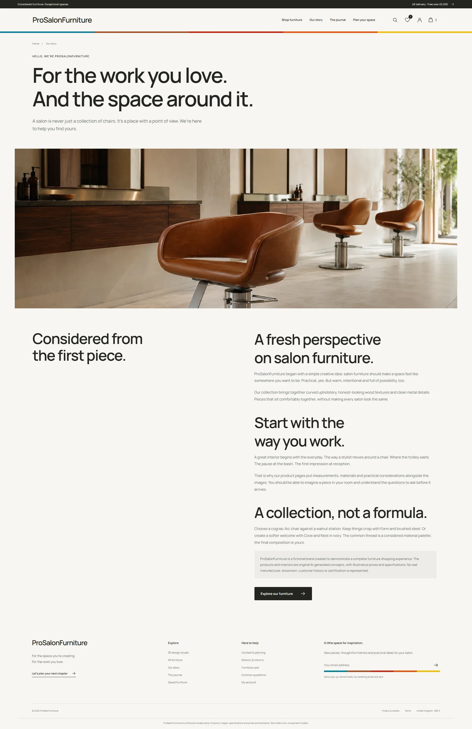
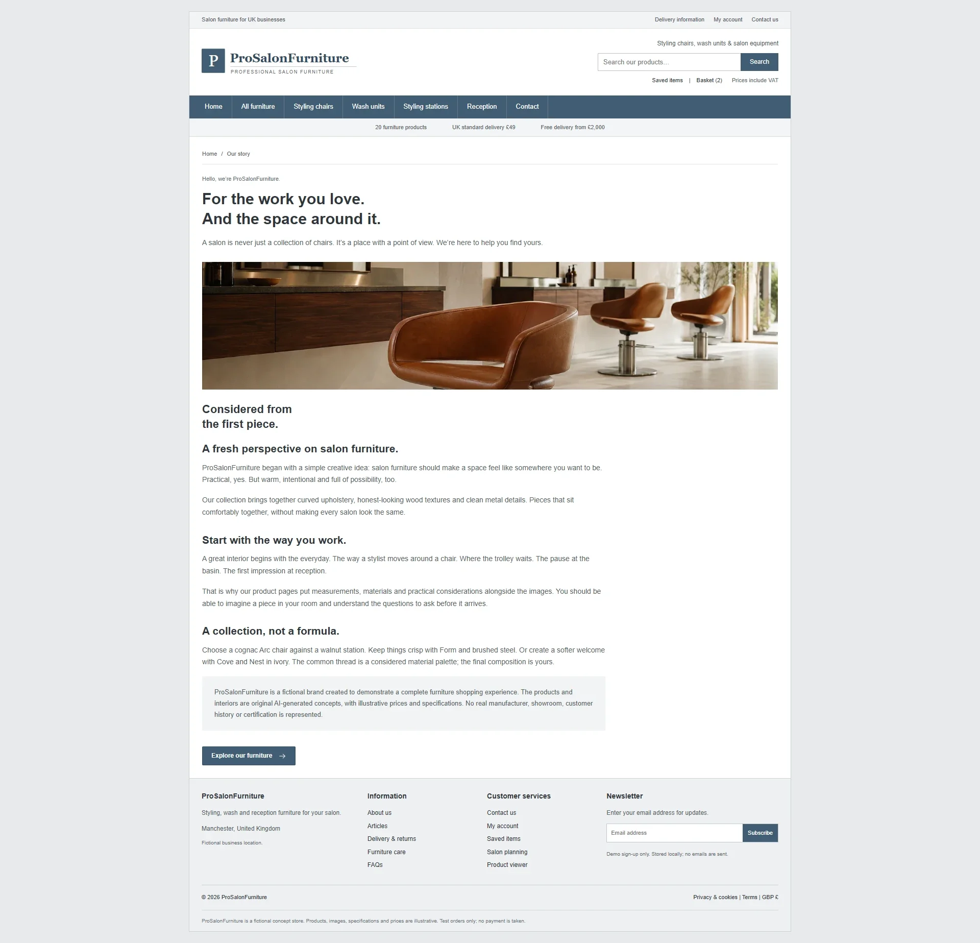 Classic layoutLaunch design
The contact page follows the same principle. Its design should show visitors how to get in touch and what to expect, without decoration getting in the way of the form. The comparison shows how a support page can share the brand’s character and still be practical.
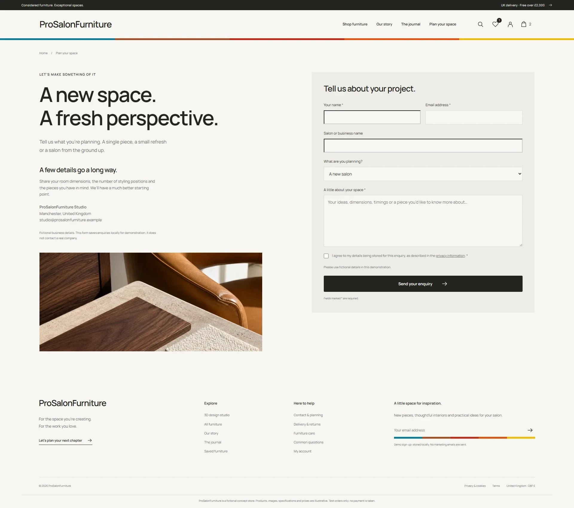
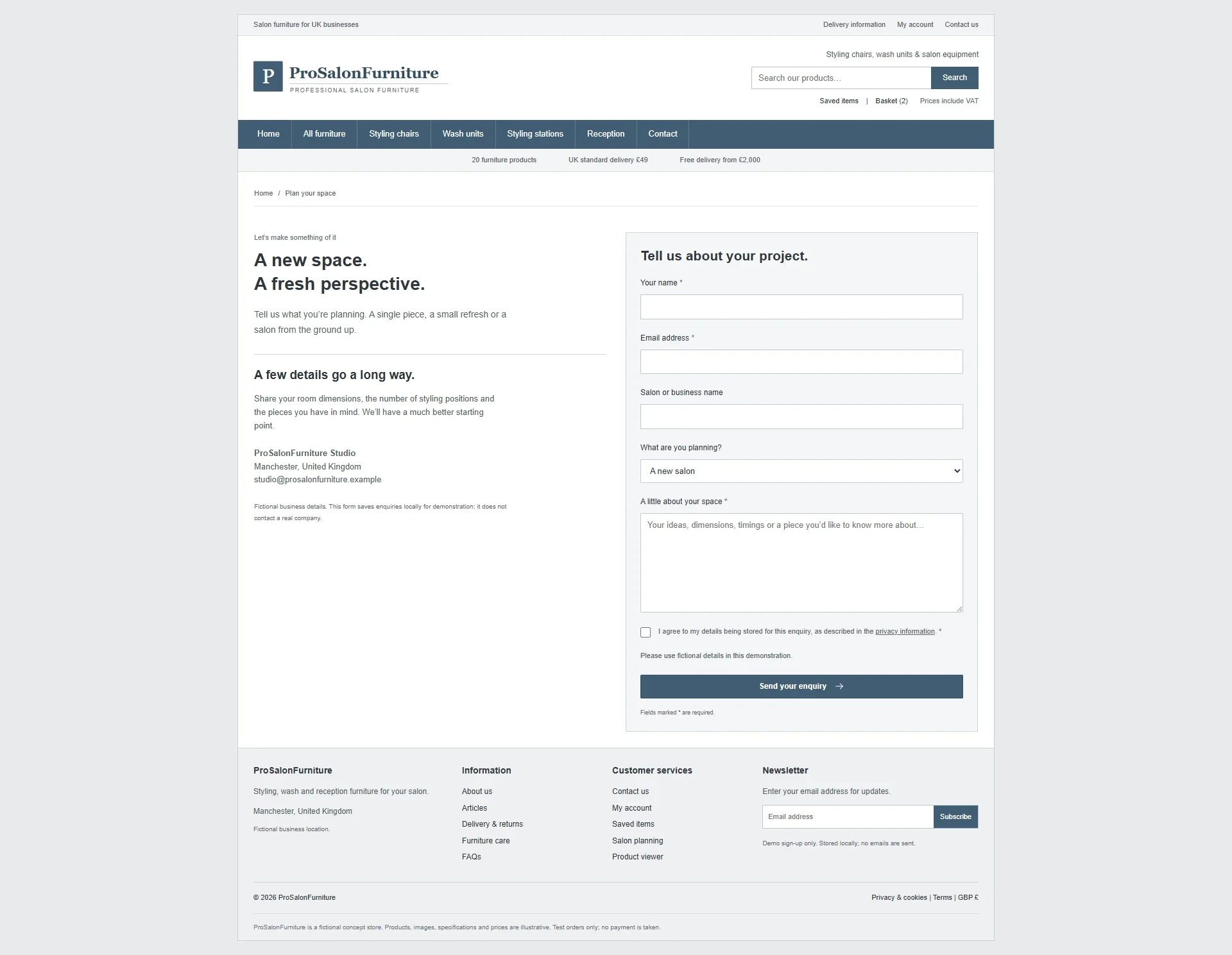 Classic layoutLaunch design
Carrying the design through checkout
The basket and checkout are part of the same website, so they should feel like the same website. Jumping from a distinct shop to a form that looks unrelated would break the feel built up earlier in the visit.
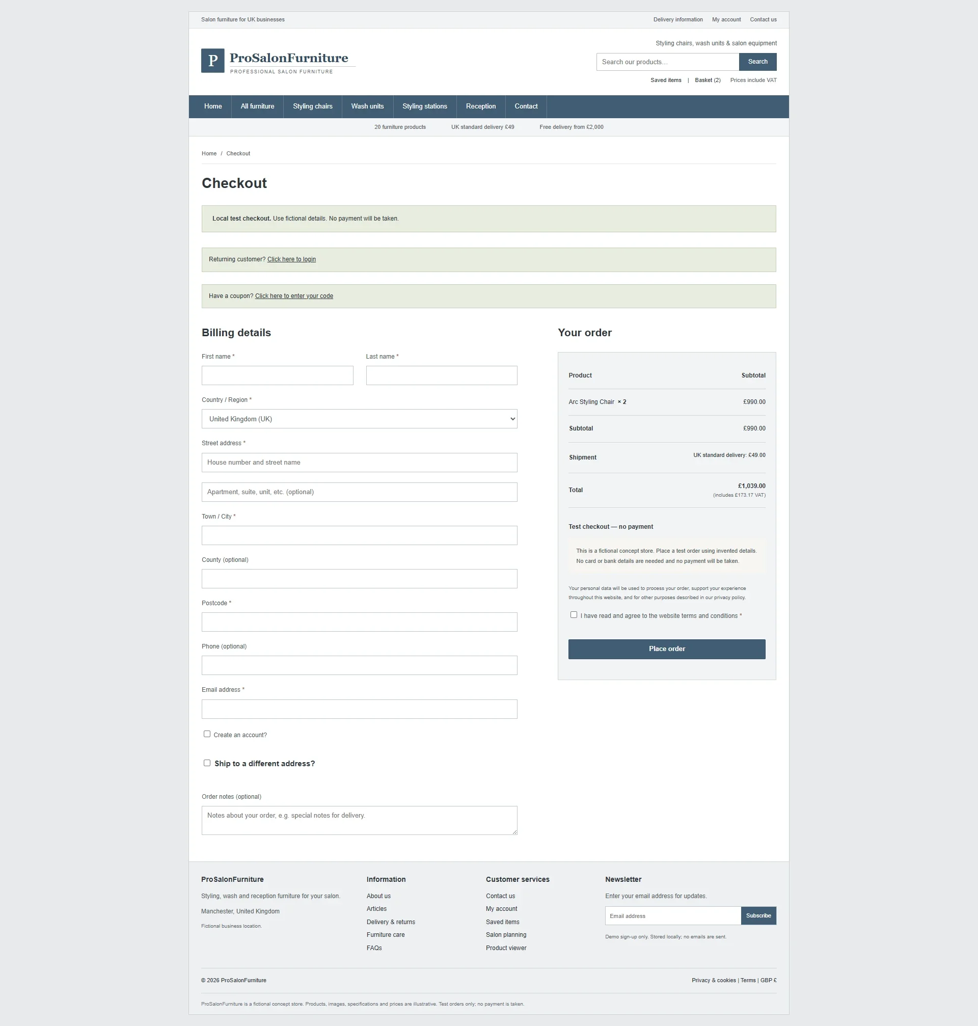
The checkout comparison shows the shared WooCommerce journey dressed in the two themes. The polished version carries the typography, spacing and hierarchy through to the final form. Labels, order information and actions remain the priority.
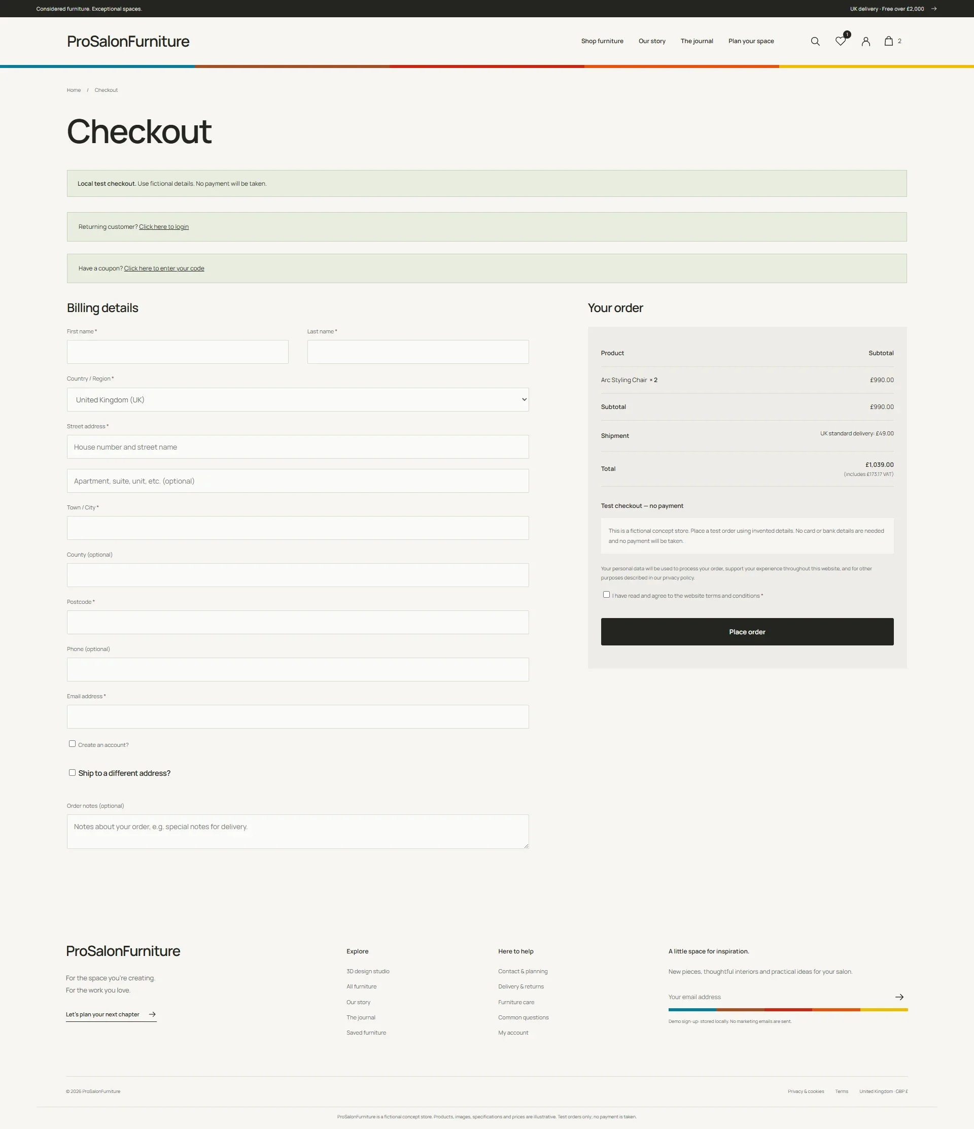
 Classic layoutLaunch design
Ready for the next stage
The website turns a 20-product catalogue into one joined-up shop, from the first view of the collection to product details and checkout. ProSalonFurniture is getting ready to launch with a distinct identity and a shop that gives the furniture room to stand out.
The result is a more distinctive brand, larger and more useful product presentation, and greater consistency across the shopping journey.
The shop is built from design choices that fit together. The logo, images, page order, product details and small repeated touches all work as one. The ribbon adds personality, but the bigger gain comes from giving each page a clear job and carrying that through the whole site.
If your catalogue is sound but the website no longer reflects the quality of what you sell, I can help with the design and development of your ecommerce website. The starting point is understanding the products, the people buying them and where the current experience makes that harder than it needs to be.
See more projects on my work page.