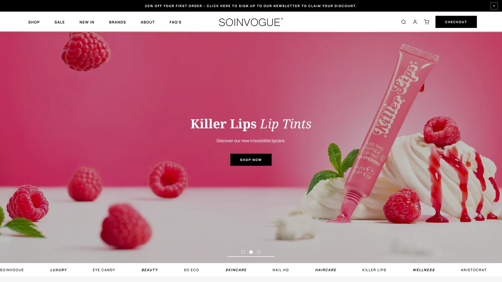
A WordPress ecommerce redesign combining technical modernisation with a complete design overhaul, bringing a multi-brand beauty marketplace into line with the business behind it. Designed and built in a six-week solo sprint.
One marketplace, many distinct identities
Soinvogue is the marketplace for In Vogue, a business with a portfolio of beauty brands. Those brands share a broad industry, but they serve distinct audiences and needs: eco-conscious beauty tools, male grooming, lip products and more. Brushworks, So Eco, Nail HQ, Eye Candy, Invogue, Aristocrat and Killer Lips each need room to communicate their own identity.
That made this project more than a visual refresh. The website had to work as a shared storefront for the whole portfolio, while its existing technical and design limitations were getting in the way. Speed, loading times, functionality, navigation, parts of the copy and browser rendering all needed attention. Core Web Vitals were also a concern. In my assessment of the project, those issues were contributing to weak search visibility and conversion performance.
I approached the work structurally, redesigning the storefront and building its WordPress theme over six weeks. I handled the design and implementation myself, bringing together ecommerce website design and development across the shopping journey. The aim was to make the site work like what it really was: a marketplace where brands and products are easy to find, understand and buy.
A broader identity for the marketplace
Soinvogue did not need to compete with its own sub-brands for a narrowly defined identity. It needed a visual language broad enough to accommodate them. A sustainability-led aesthetic could suit one part of the range and feel wrong for another; the same would be true of a storefront built entirely around male grooming or lip products.
I moved the shared presentation towards the wider world of beauty and fashion. Photos, magazine-style type and a calm interface give the marketplace its own character. Each brand still brings its own images, packaging and personality. That split matters. The marketplace keeps things consistent, and the brands bring much of the variety.
The homepage: giving the photography room
In Vogue’s photography is one of its strengths. The previous homepage divided its opening into an image compartment and a separate text column. I removed that division and overlaid the campaign copy and action on the photograph, giving the image more room to establish the mood.
The result is a more cinematic opening, with the message and image read as one composition. It also changes the sequence of the introduction. Product cards had appeared too early in the previous homepage; I gave the opening more breathing room before moving into the shopping content.
This was a deliberate balance between impact and efficiency. The hero gives a campaign space to communicate, while the sections below provide clearer routes into the portfolio. The homepage can introduce the retailer and its brands before asking someone to choose an individual product.
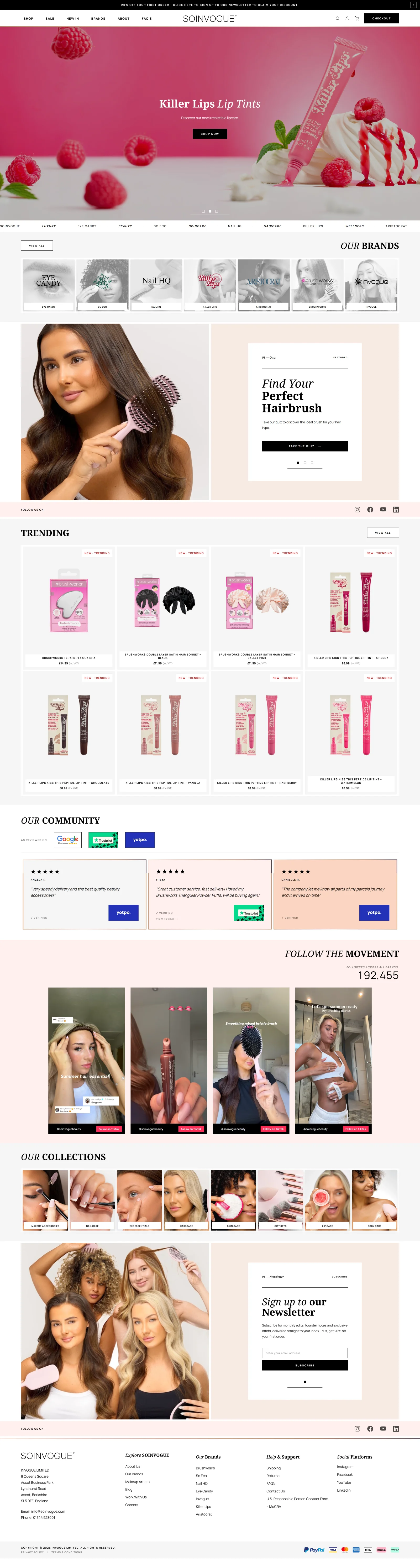
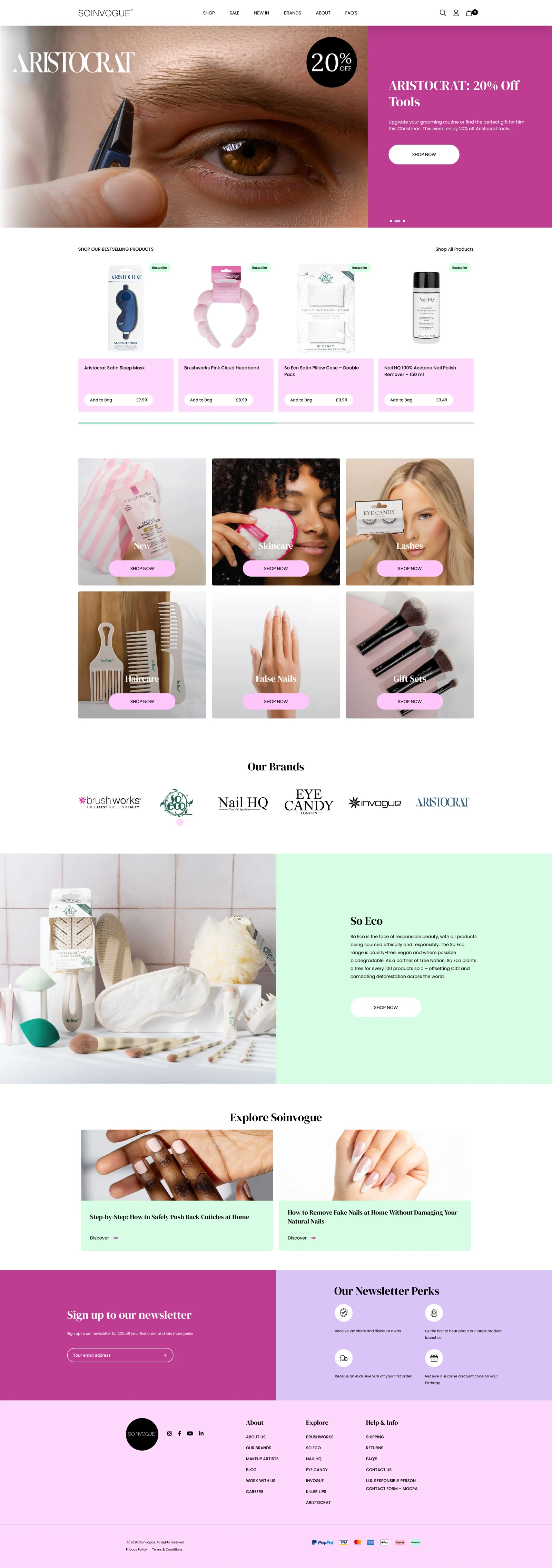 BeforeAfter
Brand discovery: making the portfolio visible sooner
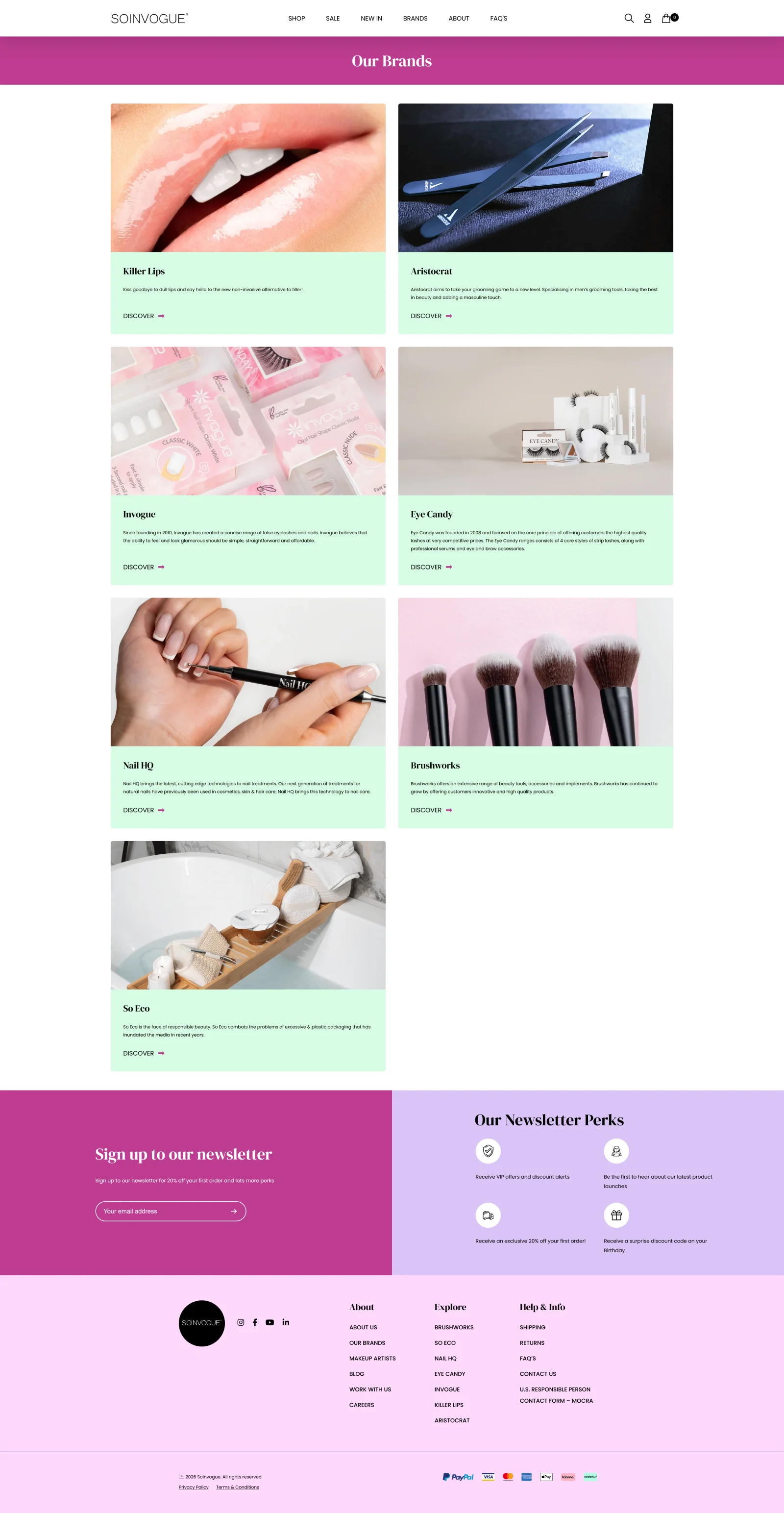
A recurring problem was how much scrolling it took to understand what was available. The old brand page used several screenfuls to introduce a portfolio that I wanted visitors to recognise much earlier. For a marketplace whose purpose is to bring these brands together, that was a significant mismatch.
I built a compact discovery row near the top of the redesigned page, combining brand imagery with the official logos. The objective was to bring all the sub-brands into the first desktop viewport and make their distinct identities apparent at a glance. More detailed introductions follow in a contained layout underneath.
This creates two levels of information: recognise the portfolio quickly, then explore a brand in more detail. Visitors no longer need to work through a long series of introductions simply to find out which brands the marketplace carries.
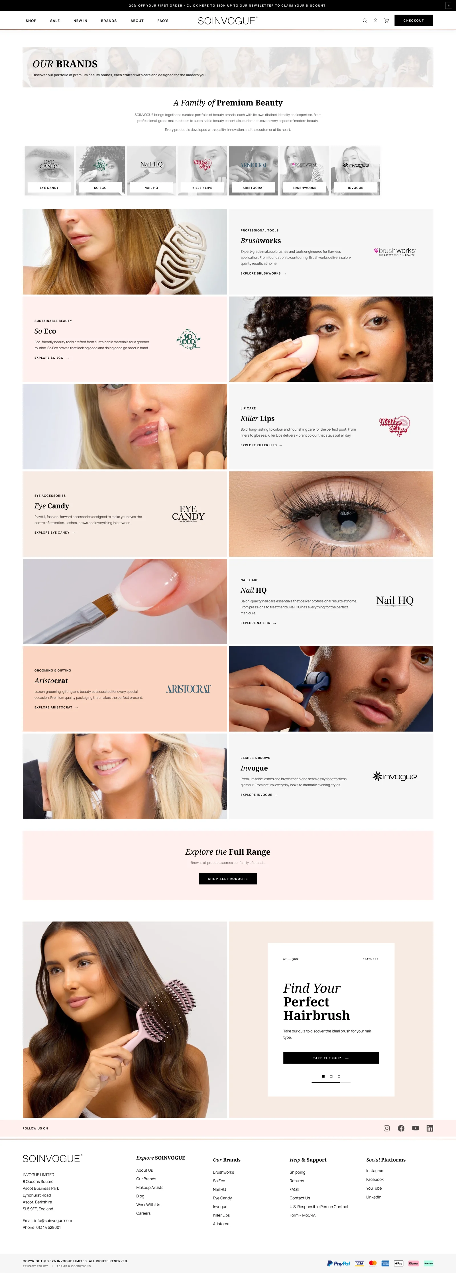
 BeforeAfter
Product browsing: getting to the range faster
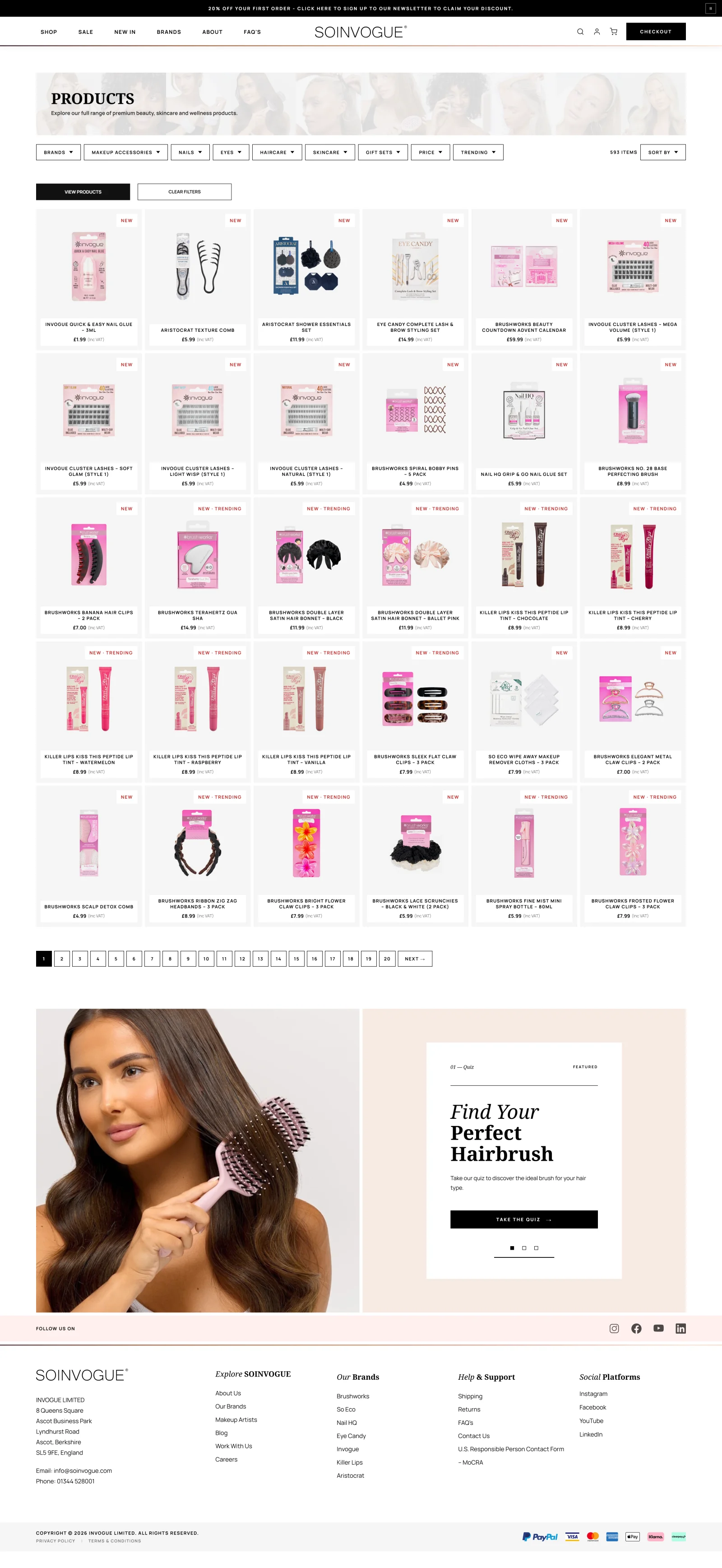
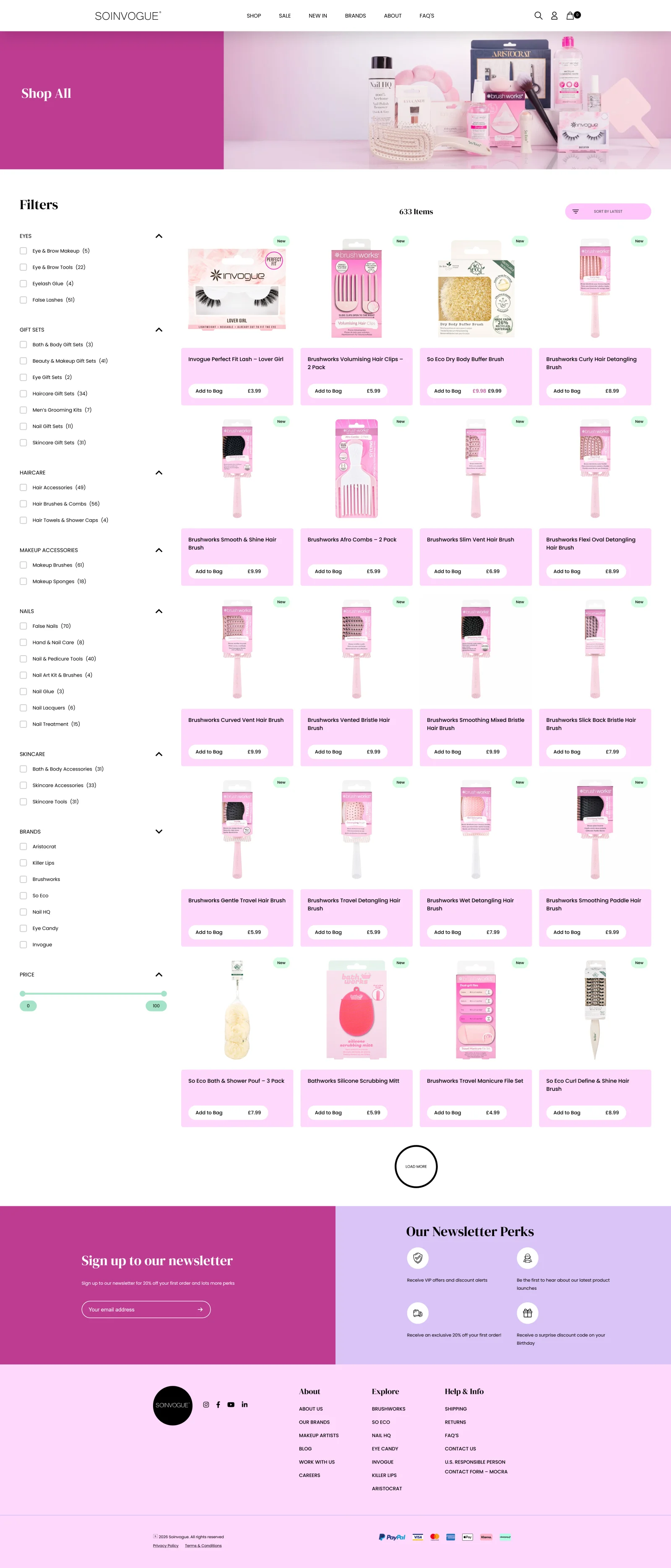
The shop page followed the same principle. A large header, page hero and persistent filter area can consume the space a visitor came to use for products. I wanted the range itself to appear sooner, with more items available to compare in the first view.
I reduced the product-card footprint and reorganised the surrounding controls around dropdowns and a dockable filter system. The aim was to keep filtering accessible without allowing it to dominate the browsing experience. A more compact animated hero provides a visual introduction without pushing the catalogue as far down the page.
Showing more products is useful only if each card remains understandable. The revised layout keeps the product image, name, price and relevant labels together, so visitors can scan the range and decide where to look next. The priority is getting someone closer to the product they want with less interruption.
 BeforeAfter
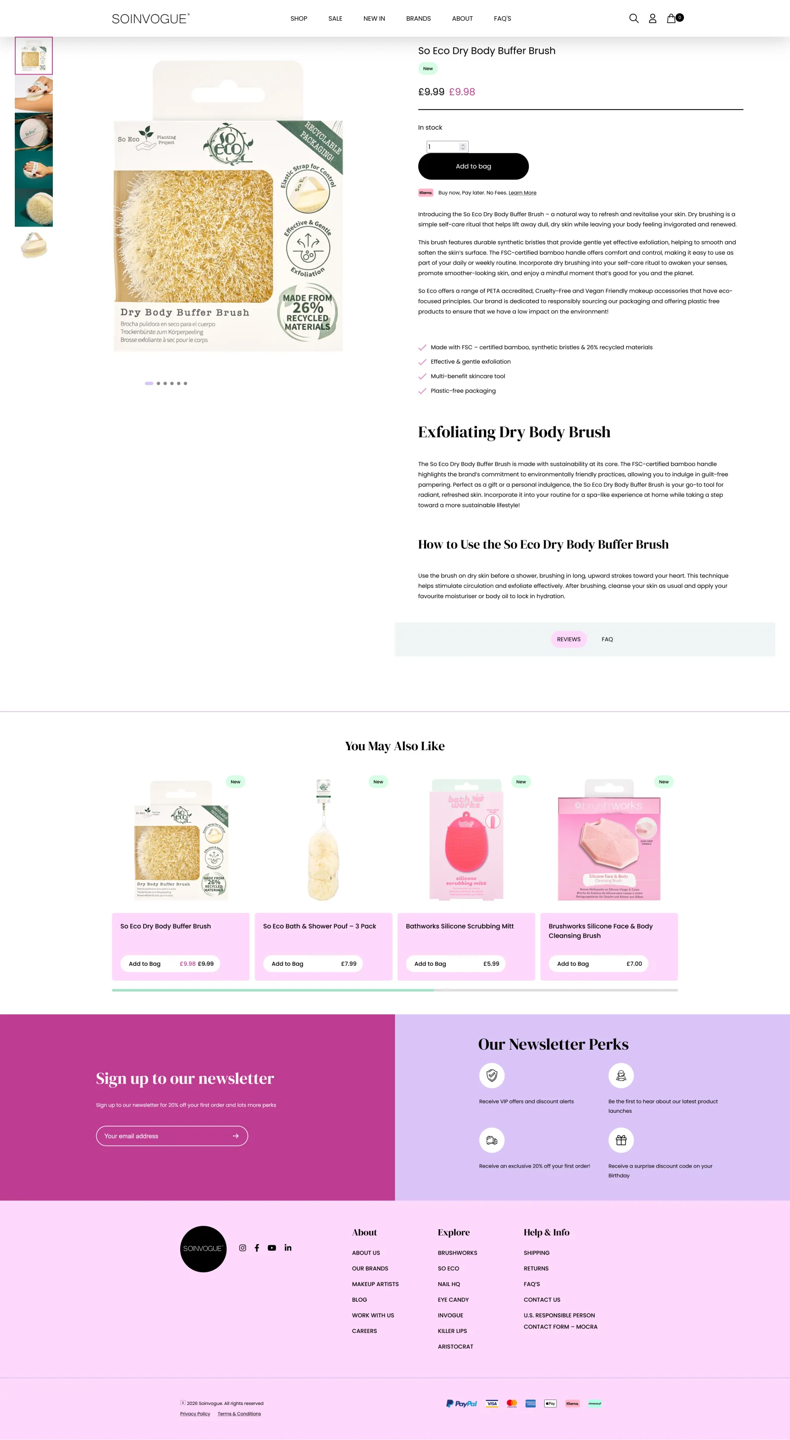
Product pages: more useful information at first glance
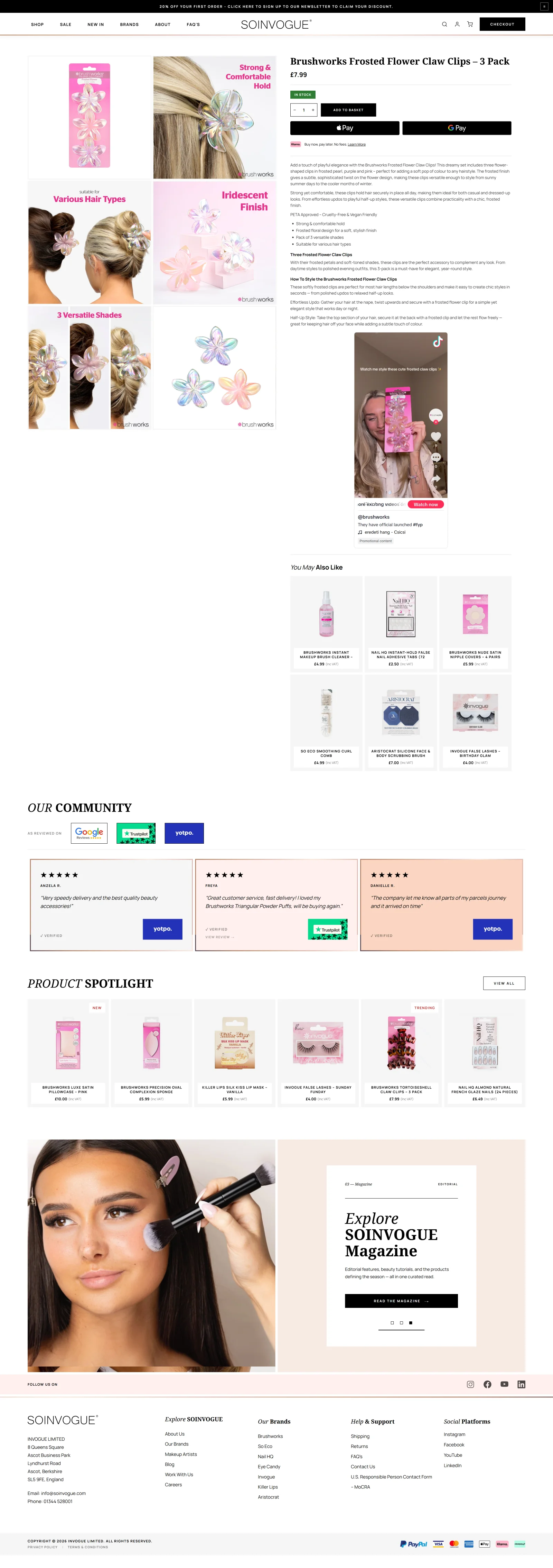
On product pages, I wanted the opening view to communicate more of what a shopper needs to know. The company already had enriched photography capable of explaining and selling its products. The redesign gives that material a more prominent role by arranging the product images in a grid.
Instead of making the visitor uncover each image in turn, the grid presents several images together. I worked to fit as much useful photography as practical into the first desktop view, alongside the product information and buying controls. It makes the breadth of the visual material apparent immediately.
I also reformatted the copy and purchase area, introducing more buying options and improving the relationship between the product description and the next action. The tighter layout made room for a social media post near the buying details. It adds customer context and reassurance while someone is deciding.
The comparison below uses different products, so it shows the page layout, not a like-for-like change to one item. The key change is how photos, copy, buying options and extra content share the space.
 BeforeAfter
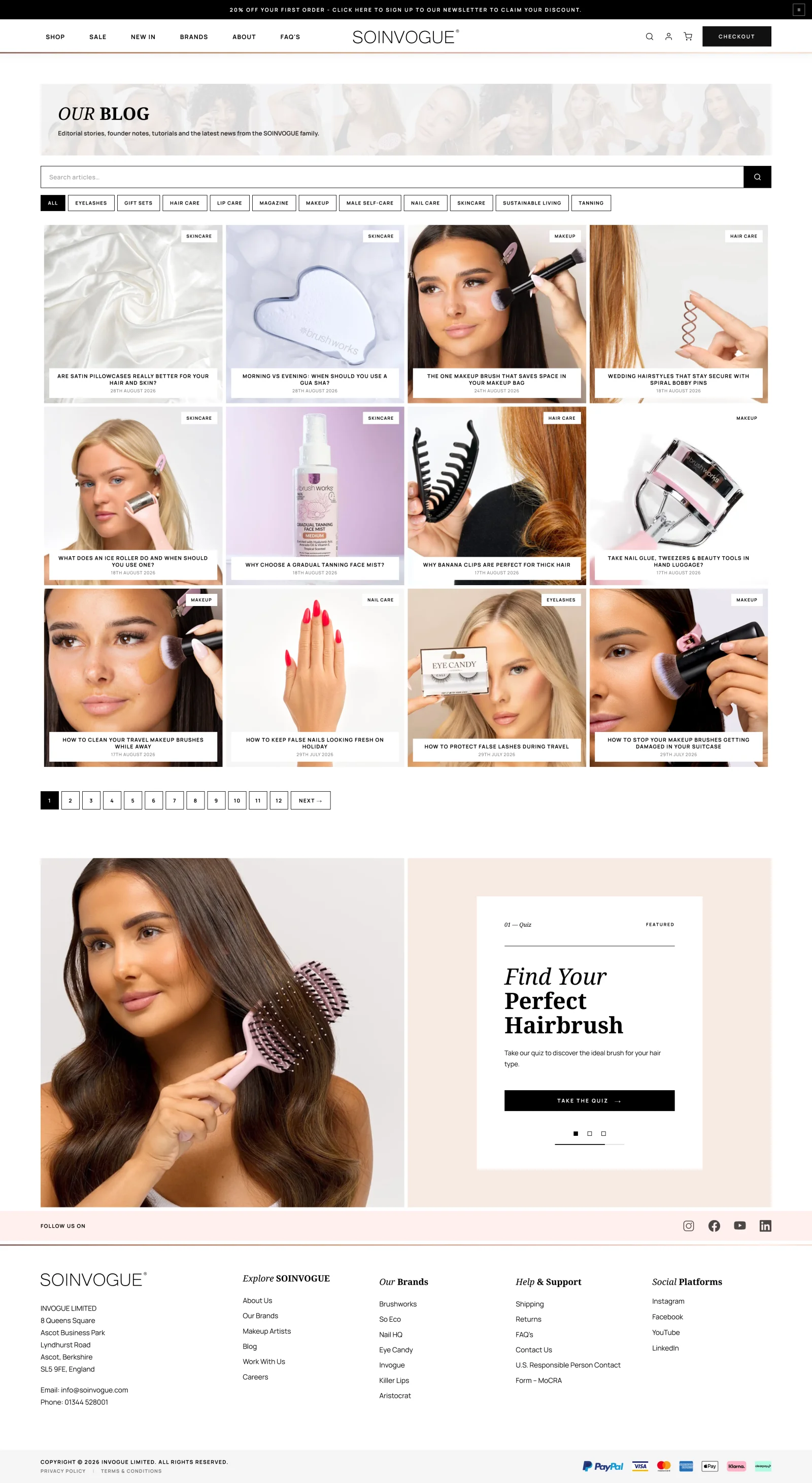
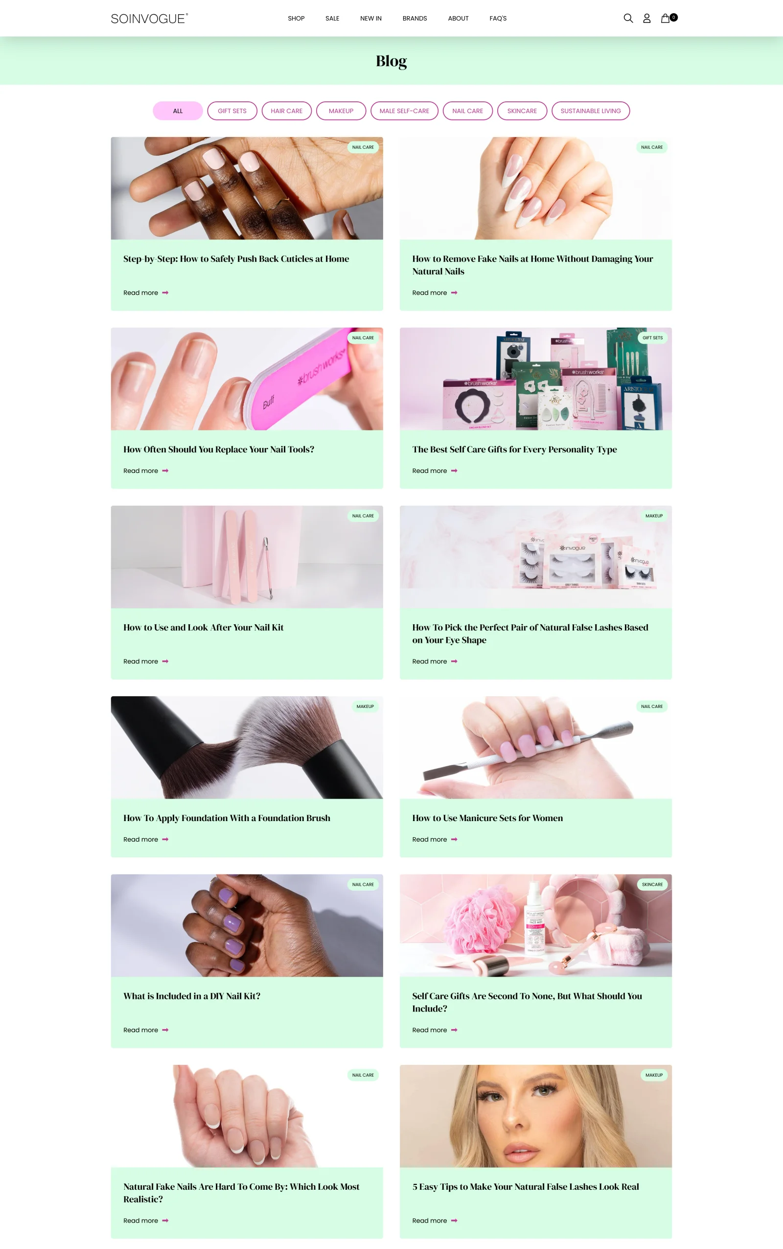
The blog index: more routes into the content
The blog index had a similar problem to the shop page: too much of the opening view was spent before visitors could make a useful choice. I wanted someone to see more articles straight away and reach a relevant subject faster.
I added search, refined the category and filter cards, and changed the proportions of the article cards. Each card became a more self-contained composition, with its text overlaid within the image treatment. That reduced the space required for each article and allowed more of the available content to appear together.
An animated visual hero gives the index a stronger introduction, while search and the revised cards make it more useful as a place to find something specific. It carries the broader beauty-and-fashion direction through to the editorial side of the marketplace.
 BeforeAfter
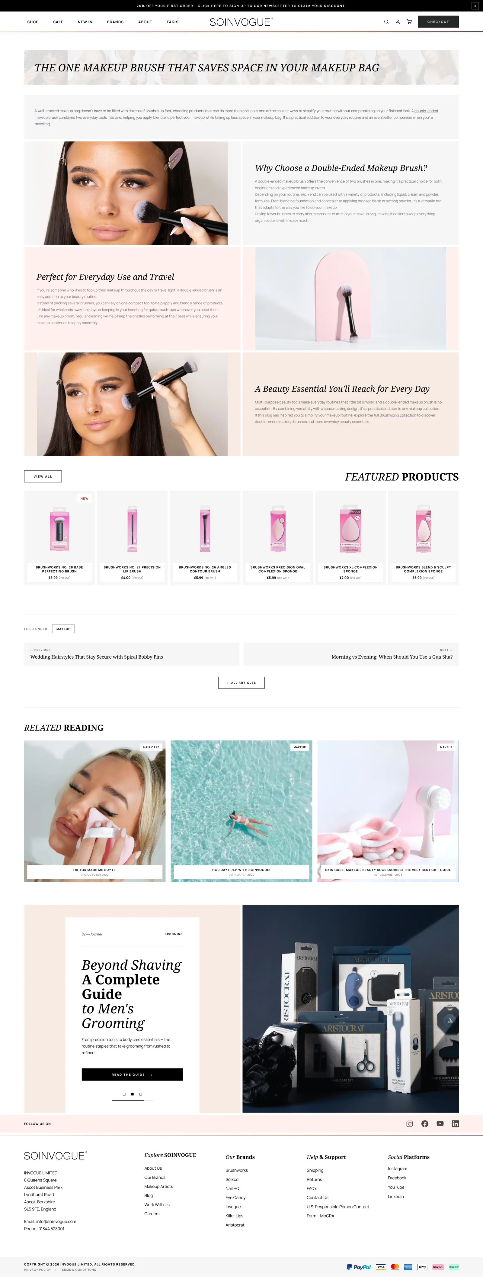
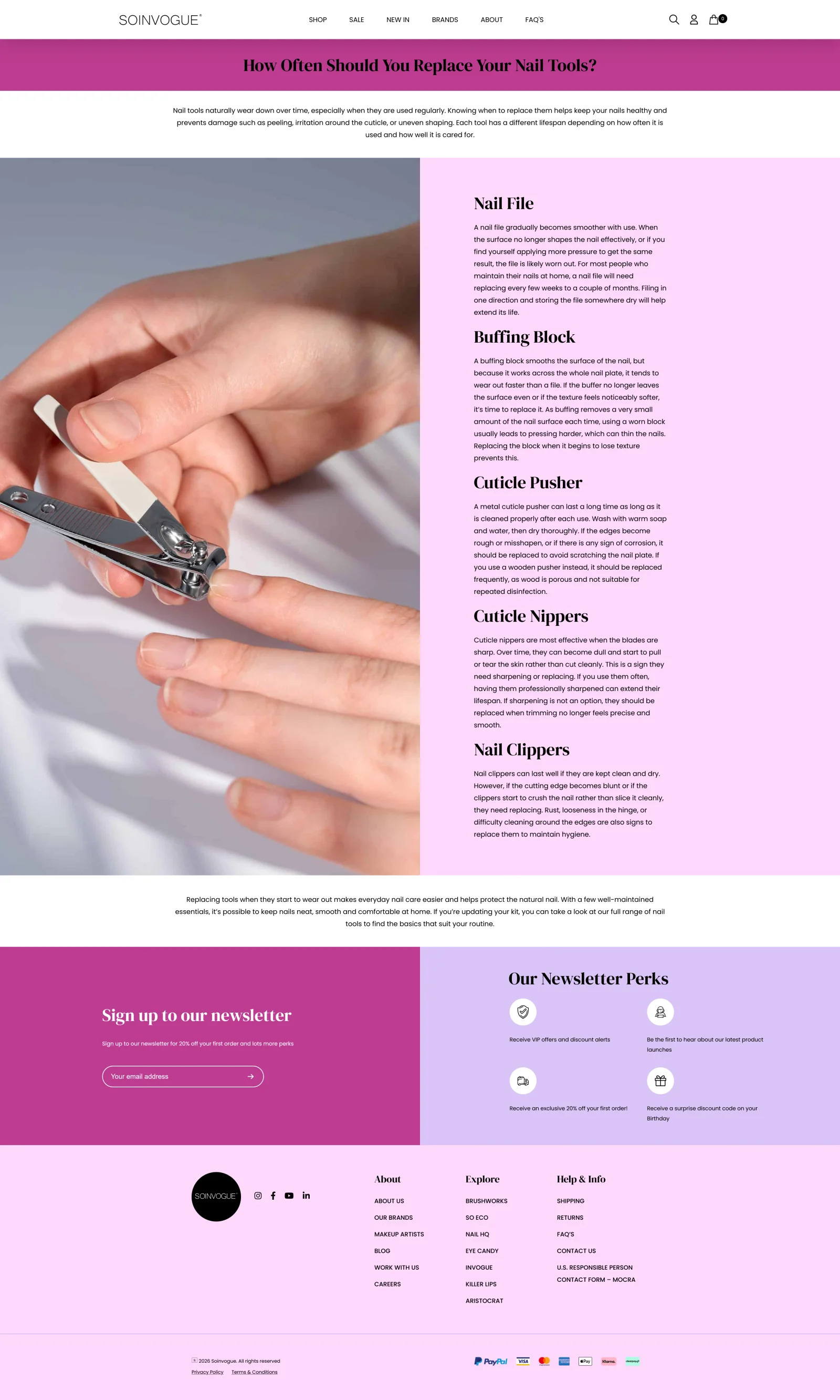
Editorial articles: rebuilding how the content is presented
The article redesign went deeper than changing fonts and spacing. I changed how the existing Advanced Custom Fields (ACF) content was interpreted and rendered by the WordPress theme. A custom presentation structure allowed the same underlying information to be assembled differently on the page.
That made it possible to show images better and add stronger formatting, colour schemes and layout variety to articles. Content that had felt plain could become a more modern read, with headings, images and text working together more clearly.
The goal was articles that were easier to read and felt part of the rest of the shop. It is a good example of the technical and visual sides meeting. Changing how the template handled existing content changed what readers actually saw.
 BeforeAfter
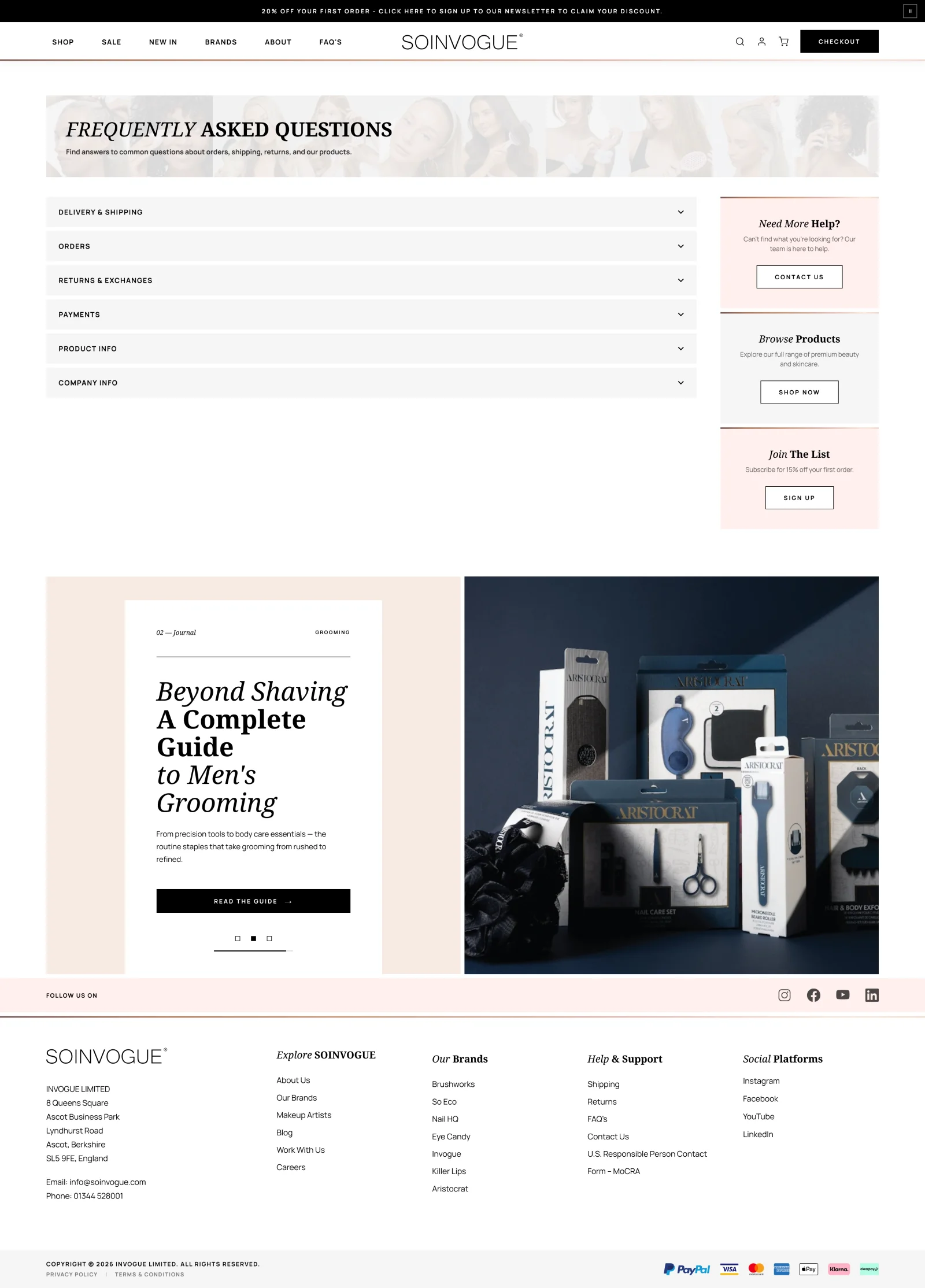
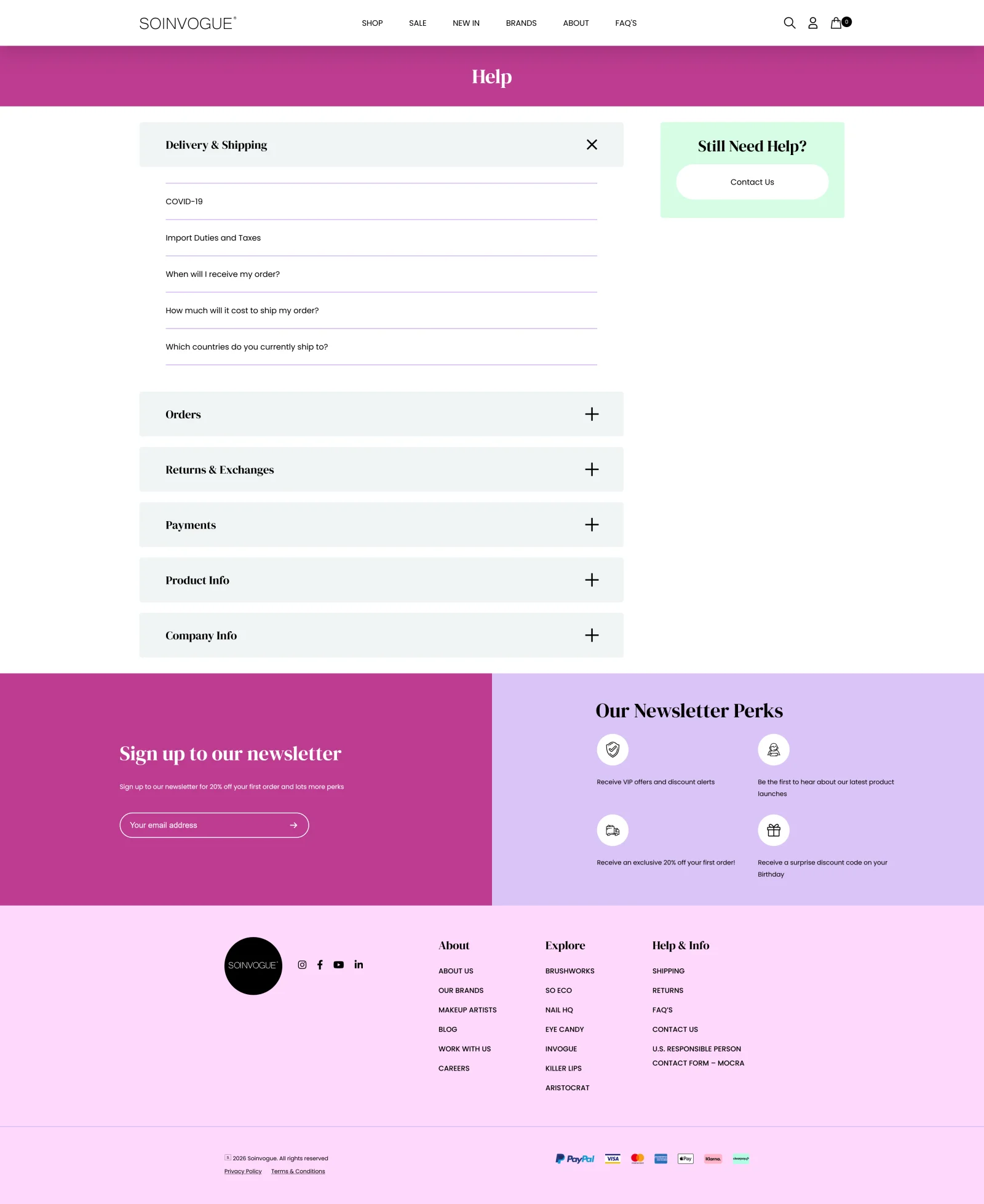
Customer support: compact answers and useful onward routes
The support page required a lighter intervention. Much of the work was a reskin, with the emphasis on making the information more compact and manageable. Rather than presenting too much at once, the revised layout helps visitors identify the part relevant to their question.
I also improved the routes away from the page. Links back to shopping, newsletter content and customer service keep support connected to the wider website. Someone arriving with a practical question should have a clear next step once they have found an answer.
 BeforeAfter
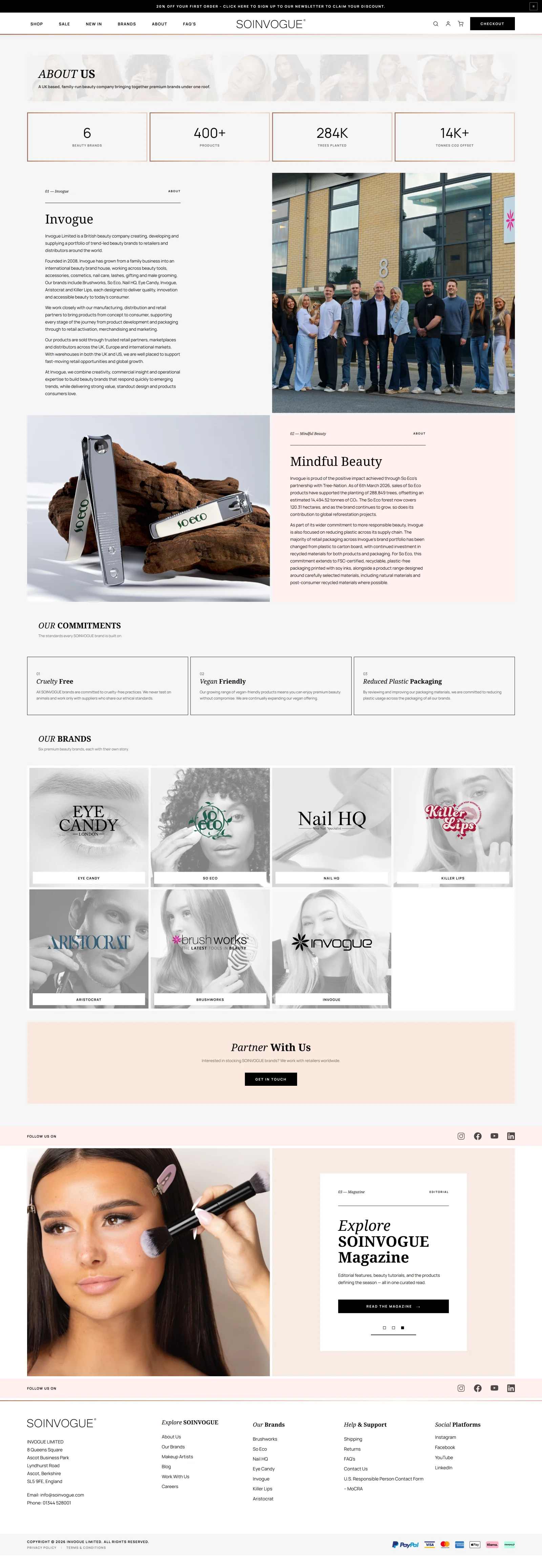
About In Vogue: showing the business behind the brands
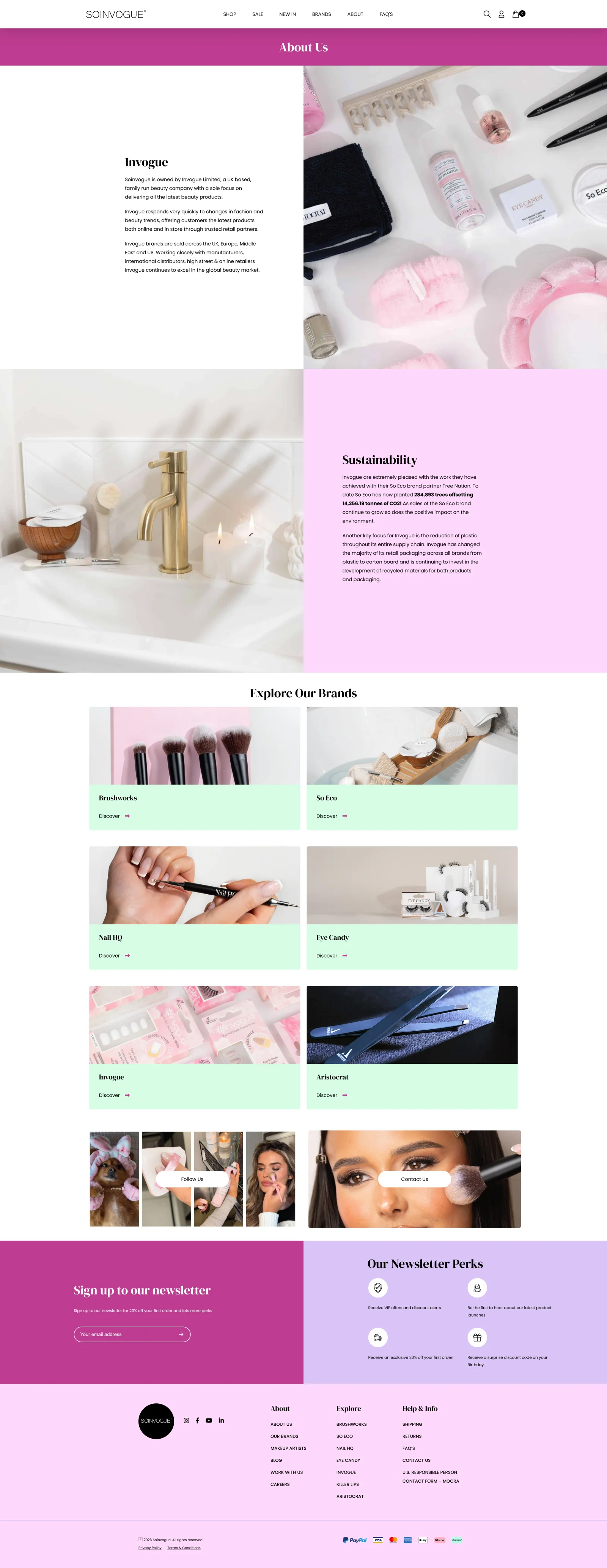
The About page was an opportunity to make the company itself more tangible. The marketplace brings together several identities, but there is a real business and a team behind them. I wanted the page to communicate who In Vogue is now and give its achievements more prominence.
I introduced a statistics grid near the top to highlight selected company figures, strengthened the copy, and included a photograph of the staff. The figures establish scale and achievement; the team image adds the people behind that account.
That combination moves the page beyond an abstract company description. It gives visitors a clearer introduction to the organisation responsible for the brands and the storefront they are using.
 BeforeAfter
The basket: a faster review and more relevant recommendations
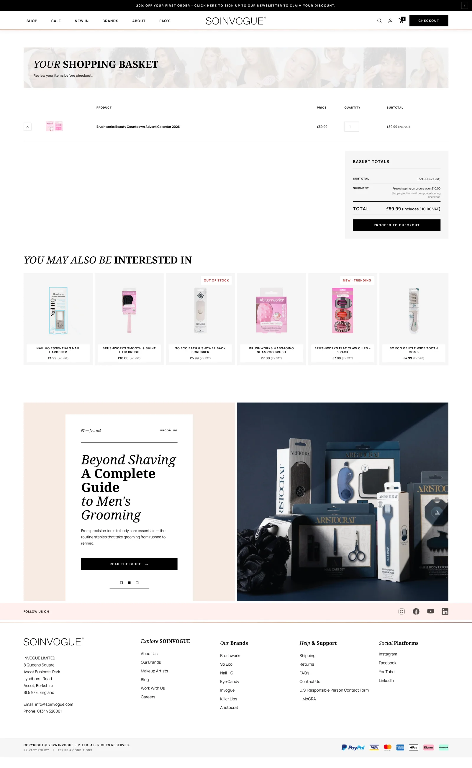
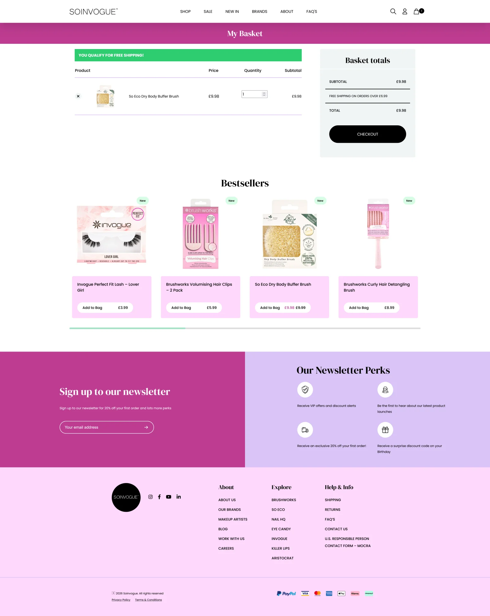
The basket needed to be more efficient, both in its performance and in the information it presented. Someone who has already chosen products should be able to review that choice and move towards checkout without unnecessary friction.
I also introduced dynamic recommendations based on the contents of the basket. That gives the recommendation area a specific purpose: suggesting relevant additions in the context of what the customer has already selected. The suggestions change with the basket rather than presenting the same generic selection to everyone.
The new basket met the project’s goals for speed and recommendations. The reported result was stronger basket conversion and a more responsive feel. The comparison shows the layout. The changing recommendations only appear on the working site.
 BeforeAfter
Checkout: custom implementation, familiar presentation
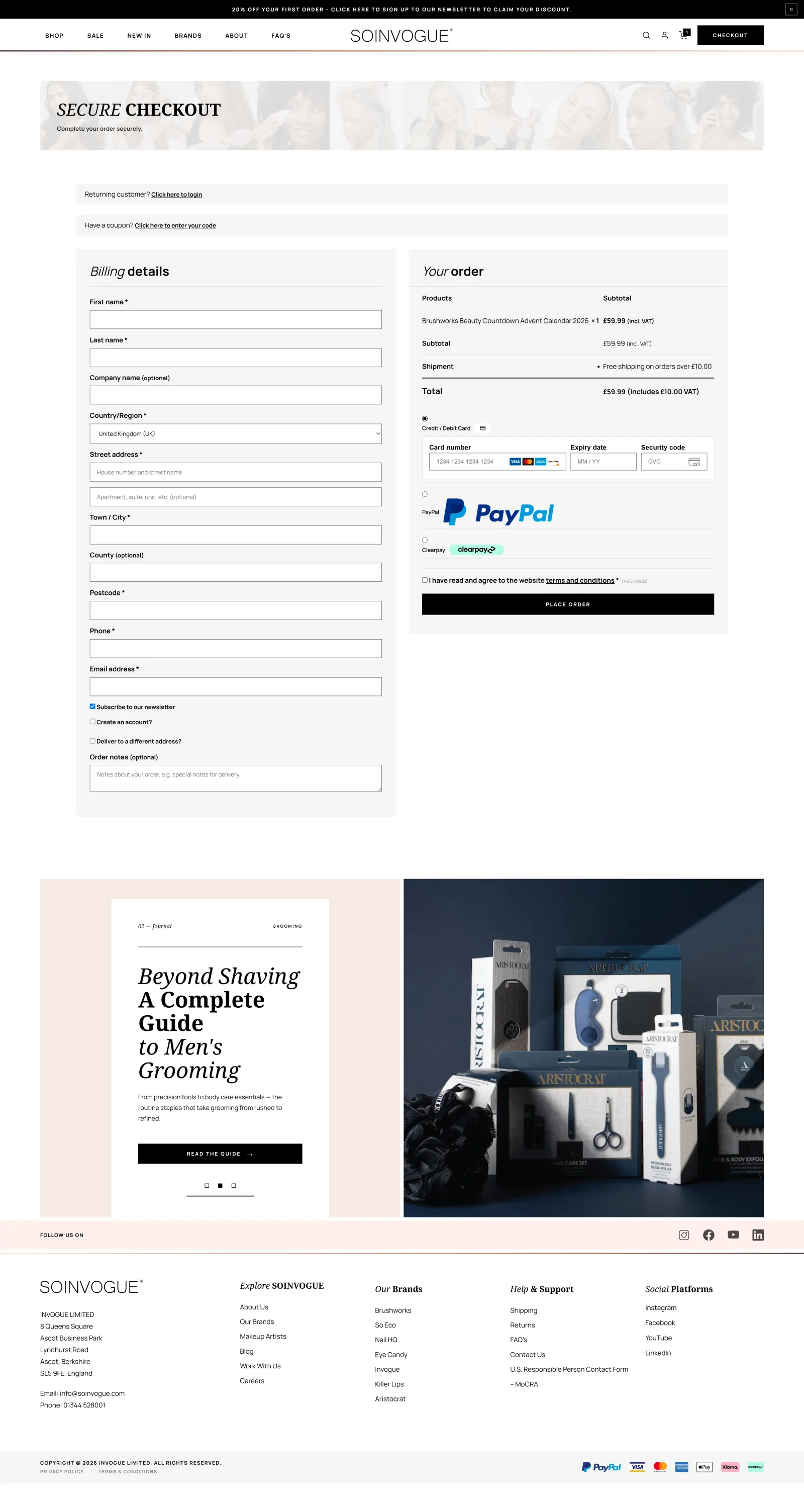
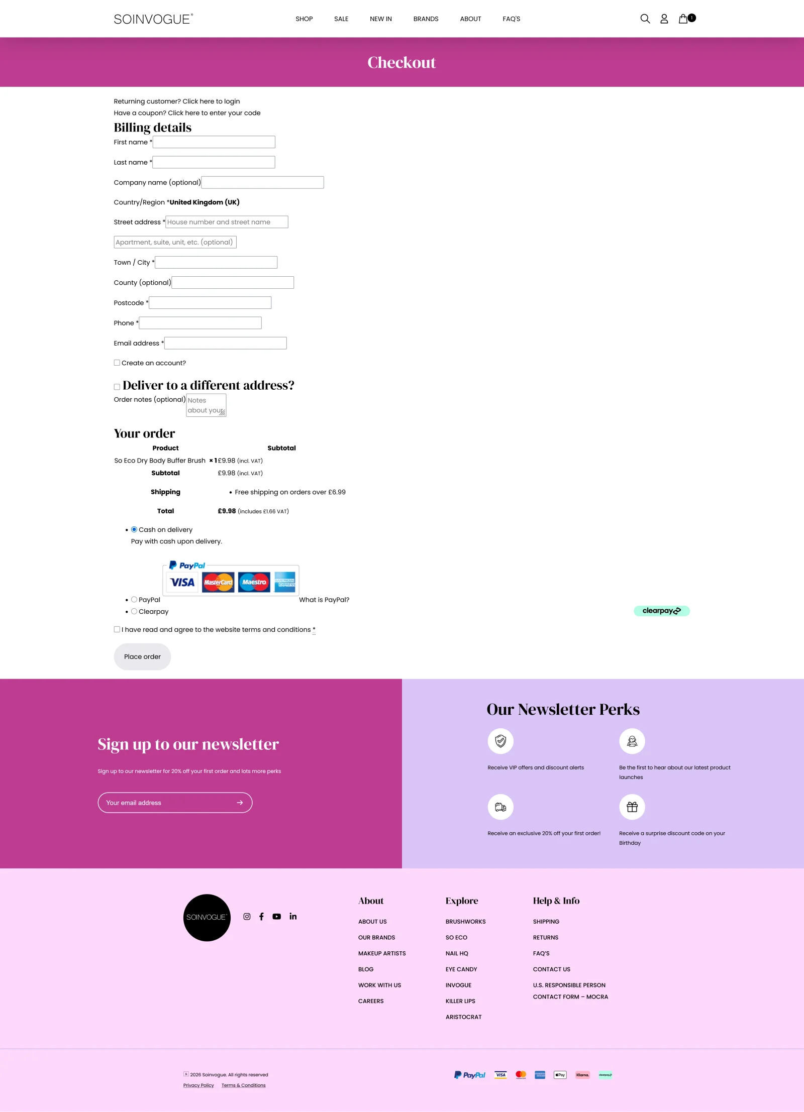
The existing checkout relied on a plugin that was causing loading and performance problems, particularly on mobile. At the point where a customer is ready to buy, those delays were especially unwelcome. I removed that checkout plugin and built a custom checkout page in its place.
Security and established checkout practices were requirements of the build. Visually, I kept the layout conventional: the aim was to make the purchase process feel familiar and straightforward. This was a place to reduce uncertainty, with clear information and predictable steps.
The custom build fixed the speed problems caused by plugins and kept that familiar layout. Feedback on the checkout results has been very positive. It mattered for a simple reason. The gains elsewhere in the shop needed to carry through to the moment of purchase.
 BeforeAfter
The newsletter: making the invitation worth noticing
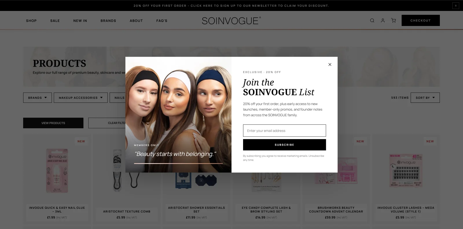
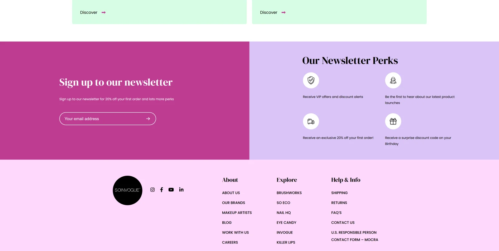
The previous newsletter treatment was easy to overlook: a plain banner, a small amount of text and a couple of SVG icons. It had little of the photography or visual character used to promote the products. I wanted the invitation to stay in touch to receive the same attention as a campaign.
I added a styled lightbox with prominent photography, display typography, a clear message, a call to action and the sign-up form. The newsletter became a full visual design, with enough presence to make its point, instead of a thin strip tucked away on the page.
The lightbox makes the invitation active and visible. It gives visitors a clearer, more appealing reason to sign up, using the same visual strengths as the rest of the redesigned shop.
 BeforeAfter
Six weeks of design and technical modernisation
I completed the planned overhaul in six weeks, handling both design and development. I treated the website as one connected system. That meant its marketplace identity, how fast visitors could make sense of the brands and products, how existing content was displayed, and the technical limits that had been hurting the experience.
Following the overhaul, the business saw improvements in SEO performance, sales, retention and engagement. My account of the project is that the changes made a substantial contribution to those gains. Those are qualitative reported outcomes here; this case study does not provide a controlled attribution analysis or percentage uplifts.
The comparisons make the design changes directly inspectable. The wider lesson from the project is the importance of matching a website’s execution to its role. For Soinvogue, that meant giving a diverse beauty portfolio a coherent marketplace, making more useful information available sooner, and carrying the design through the whole shopping experience.
Planning a comparable redesign? Use the ecommerce website brief to describe your product range, integrations and launch requirements, then explore ecommerce development services.